Posted on 13 Comments

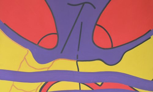
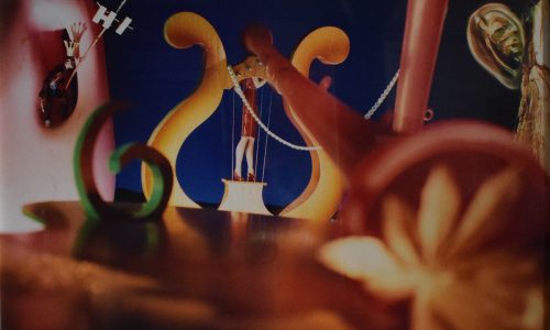
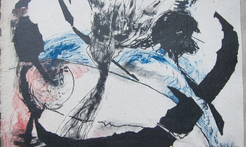
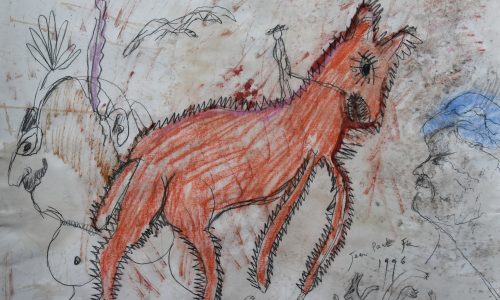
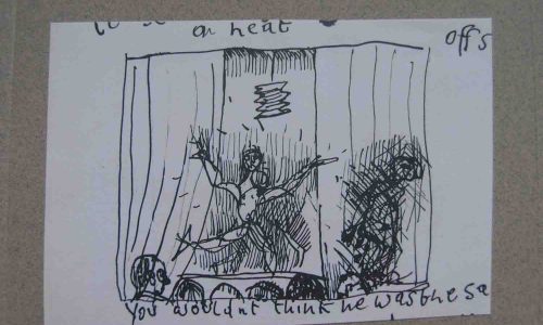
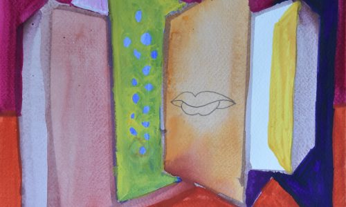
Siegfried Anzinger (1953)

Schermafbeelding 2019-03-25 om 11.23.04

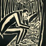
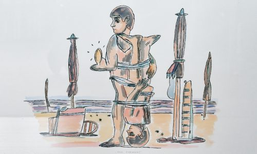
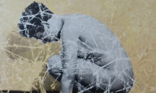
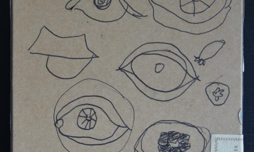
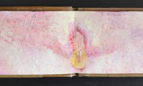
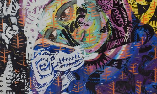
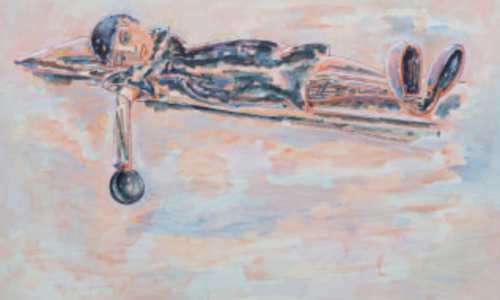
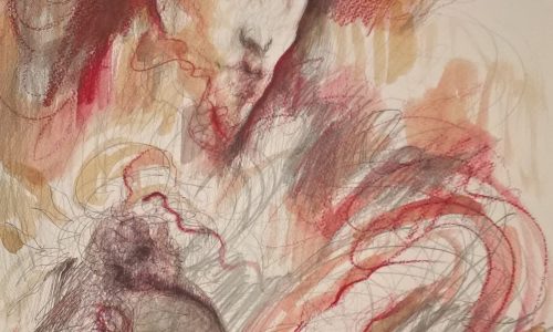
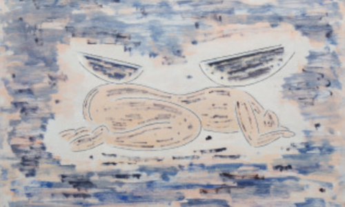
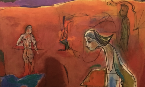
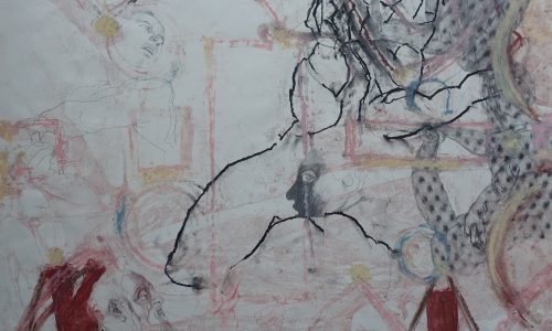
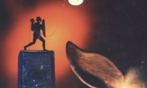
At the time Anzinger had an exhibition at the Gemeentemuseum Den Haag ( curated by Franz Kaiser  i was not very interested in this kind of art, but sone 25 year ahead in time thingds change and now i find his work at least….INTERESTING and INTRIGUING.

Perhaps that is because i have learned to appreciate this kind of art. His paintings remind me of some of the ones Bacon has made and in the Netherlands John van ‘t Slot approached his subjects in the way Anzinger does. (Van ‘t Slot and Anzinger are from the same generation) and still they are rooted in the Austrian way of painting.

Schermafbeelding 2019-03-25 om 11.27.05

If you try to find some information on Anzinger you will have a hard time finding it. There is some put on line by his gallery  MAX WEBER, but even this information is not very elaborate. An interesting artist, but hard to keep track of his works, because outside Germany and Austria his work is rarely seen.

www.ftn-books has one important publication on Anzinger available

OLYMPUS DIGITAL CAMERA


Posted on 8 Comments

Gilbert & George, Bulletin 20

gilbert & george bulletin 20 b

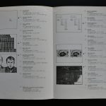
In a period of 21 years the Art & Project gallery published 156 Bulletins. Among them several by Gilbert & George and one of these is the iconic BULLETIN 20 which was send from Japan to the subscribers of the Bulletins. This was a select circle of artists, coillectors, fellow gallery owners and museum who were the lucky ones to receive these publications by Art & Project. This BULLETIN 20 was published in AMrch 1970 and contained on the inside the famous drawing of the GILBERT & GEORGE portraits. It is now available at www.ftn-books.com and i am sure this will be the only copy which i will have ever available.

gilbert & george bulletin 20 a

Posted on Leave a comment

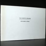
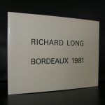
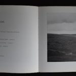
Go to the Richard Long exhibition at DE PONT

Schermafbeelding 2019-06-03 om 14.00.05

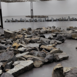
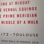
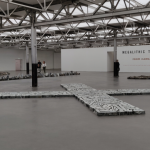
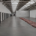
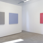
Last week we were in Tilburg to visit the Textielmuseum with the Bauhaus Textiles with our friends David and Monica from the US. Linda and I preferred to see the modern art at the DE PONT instead and we were treated to one of the best contemporary art exhibitions from the last years. In DE PONT there was a special exhibition by Richard Long, who took full use of all the spaces available. The cabinets were all filled with smaller Long works ( except for the Kapoor cabinets ) and the great hall served as the exhibition space for his stone circles, lines and crosses.

IMG_20190530_145120

The result….impressive. Here are the pics i took from the space. I gladly share these with you since these pictures do not justice to the real experience.

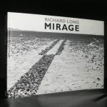
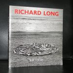
The ” look and feel” of the space is so impressive, that you must see this yourself and to prepare your visit you can chose one of the nice Richard Long publications www.ftn-books.com has for sale. This is not meant as a spoiler. Just hurry up and go there as long as the Richard Long exhibition is there.


Posted on Leave a comment

Andras Gal (1968)

Schermafbeelding 2019-03-22 om 14.48.03

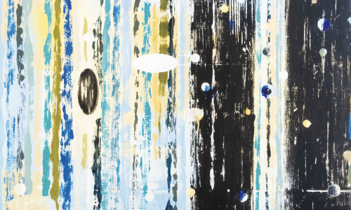
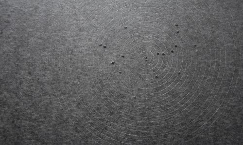
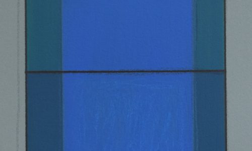
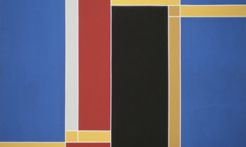
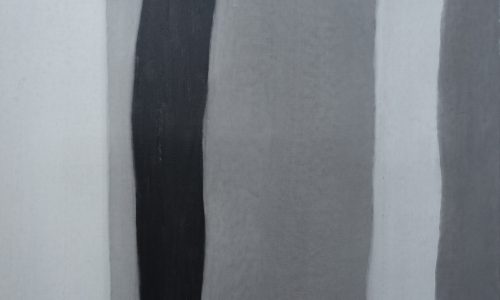
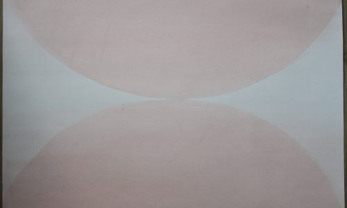
This is the kind of painting that appeals to me. Monochrome, well not completely MONOCHROME, since there is a fine kind of structure in the upper layer. It is a bit like the miniimal paintings of Tomas Rajlich , who uses the surface of the paint to form a pattern on the canvas, making the painting not flat but finely structured. Combining his Monochrome canvasses in a way that makes them a composition on their own and there you have it , beautiful paintings by this young Hungarian artist.

Max Imdahl said about Gal.

„The painting finds its way behind every order, whether innate or trained, defined conceptually, mathematically, geometrically or by a (formal) aesthetic: it finds the ground of (absolute emotion )as a kind of elementary capacity.” (Max Imdahl)

Schermafbeelding 2019-03-22 om 14.55.19

The above publication is available at www.ftn-books.com

Posted on 16 Comments

Ornela Vorpsi (1968)

Schermafbeelding 2019-03-22 om 11.42.32

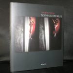
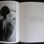
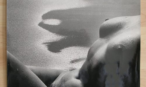
A strange but still highly collectable book is the book by Ornela Vorpsi, an Albanian writer/photographer who’s work i first encountered through a publication which is available at WWW.FTN-BOOKS.COM. An excellent and beautiful publicatioin by SCALO publishers who have a nose for new talented photographers. Photographs which are mysterious and erotic at the same time. Recommended and as said …..collectable.

Posted on Leave a comment

Fred Carasso (1899-1969)

Schermafbeelding 2019-03-21 om 16.12.15

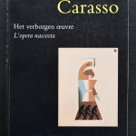
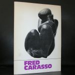
Fred Carasso is most known in Rotterdam for his sculpture memorial DE BOEG he executed in Rotterdam, but there has been a revival lately, because since a few years a noticed an increase in demand for his publications. The latest one i have available is designed by Rutger Fuchs and was made for the Hannema Stuers Fundatie exhibition in 1996. An excellent publication in dutch and italian which focusses on his lesser known works . Carasso shows that his works are truly rooted in the INTERBELLUM and were influenced by Art Deco  and Bauhaus. www.ftn-books.com has this title available.


Posted on Leave a comment

Hanns Schimanski (1949)

Schermafbeelding 2019-03-20 om 15.01.55

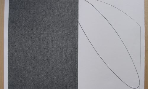
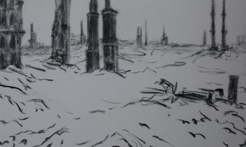
It takes some time to discover the qualities within the works of Hanns Schimanski but his touch and art language are truly original. His works remind me the most of Jurgen Partenheimer his drawings, but his approach is totally different. he composes a drawing/painting and if necessary then folds and/ or “cuts” it visually in pieces and makes changes and reorganizes the parts and folds into a new work.

Schermafbeelding 2019-03-20 om 15.13.48

Trained as an agronomist engineer, Hanns Schimansky decides in 1979 to devote his career to art and solely to drawing. In his scriptural drawings, he invites us to feel the rhythm of the world by capturing and prolonging the un seizable intensity of the instant, convoking and provoking chance, opposing a voluntary slowing down of the breathtakingly speed of our media-centered world. Geometric forms or interlacing lines, enhanced by the folded paper, create a dynamic writing specific to Schimansky. His works are filled with movements that inhabit us such as waves and winds. The œuvre of Hanns Schimansky is composed as much of sonorities as it is of silences. The rustles of the paper folded and unfolded, the ink-pen scratching the paper, the dot repeated forever with precision, the line sliding in variable rhythms are all sounds which contribute to the harmony of the artist’s drawings.

His works have been shown in Europe at the Gemeentemuseum of The Hague, at the Staatliche Kunsthalle in Karlsruhe, at the Museum of Art and History of Neuchâtel in Switzerland, as well as the Martin-Gropius-Bau in Berlin in Germany. Schimansky’s drawings have integrated public collections such as the National Museum of Contemporary Art in Oslo, the Berlinische Galerie, the National Museum of Contemporary Art in Berlin of the Museum of Art and History of Neuchâtel.

www.ftn-books.com has some Schimanski titles available.

Schermafbeelding 2019-03-20 om 15.15.50

Posted on Leave a comment

Alice Neel (1900-1984)

Schermafbeelding 2019-03-20 om 14.51.40

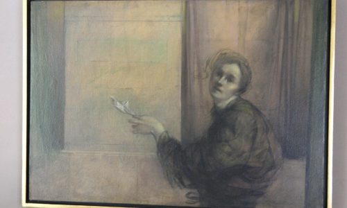
Until a few years ago the works by Alice Neel were not known outside a small circle of admirers. Among them director Rudi Fuchs and some curators from duthc Modern Art museums. the result a breathtaking exhibition at the Gemeentemuseum Den Haag in 2017. Her works remind me of Georg Grosz his very best works.

Her importance startded to grow among a small circle of admirers in the Sixties, because in the early 60s Neel moved to the more prosperous Upper West Side of New York, where her subjects began to include influential curators, art critics and dealers. At the same time, she became interested in the subcultures that were beginning to lay claim to their position in society around this time. Thanks to her friendship with Andy Warhol, she met various gays and transsexuals, including Jackie Curtis (inspiration for Lou Reed’s song Walk on the Wild Side). Neel’s portraits of Curtis and of ‘liberated’ women contributed to the public acceptance of such subcultures. In this respect, her oeuvre includes a genre familiar to us from the world of photography – for example, that of Diane Arbus – but unique in painting. By the end of her life, Alice Neel had created a body of portraits that, taken together, represented a cross-section of 20th-century American society.


Alice Neel was a figurative painter at a time when the art world was dominated first by Abstract Expressionism and later by Minimal Art and Pop Art. Figurative painting was regarded as a thing of the past. Indeed, in the 1960s and ’70s painting itself was declared dead. Although she was well aware of contemporary trends, Neel chose to pursue a path diametrically opposed to them. Consequently, her life was a constant struggle for artistic recognition. She did not achieve broader recognition until the 1970s, and then partly due to the women’s liberation movement. In the United States she is now ranked as one of the most important figurative painters of the 20th century, alongside Lucian Freud and Francis Bacon. In Europe, interest in her work has increased sharply in recent years and this exhibition can be seen as the culmination of her posthumous artistic breakthrough on this side of the Atlantic.

Schermafbeelding 2019-03-20 om 14.56.14

Posted on Leave a comment

Aaron van Erp (1978)

Schermafbeelding 2019-03-20 om 14.40.51

No better text on the works by Aaron van Erp than the one which was published on the occasion of his Gemeentemusem/ GEM exhibition from 2008. It looks a really long time ago, but nowadays his works are more or less the same. Their subjects hardly any different and the way they are painted has not changed at all. van Erp is an important “young” painter and i will be following his career from a short distance because his paintings fascinate me.

“Horrible things frequently also have a funny side.” This is how Aaron van Erp (b. 1978) explains how his paintings, despite their often brutal subjects, can raise a laugh thanks to their bizarre titles. Since graduating from the St Joost school of art and design in ’s-Hertogenbosch in 2001, Aaron van Erp has become a rising star of the art world. His weird paintings have been acquired for numerous collections in the Netherlands and abroad, including the trendsetting Saatchi collection. Aaron van Erp opens his first ever one-man museum exhibition at the Gemeentemuseum Den Haag: an overview of paintings and drawings produced since leaving art school, with the emphasis on his most recent work.

Jars of peanut butter

Van Erp’s paintings often include familiar objects from the world around us: shopping trolleys, meatballs, jars of peanut butter, supermarket bags and washing machines. These are located in bare, desert-like landscapes or huge empty interiors. His colourful pictures sometimes refer to well-known paintings of the past (The Meatball Eaters, 2000) or appear to allude to social issues like terrorism, problems in the health care system or child abuse. His painting The Child Tamer (2006), for example, featuring a shadowy figure keeping order with a whip, immediately suggests child abuse. But, despite its sadistic undertone, the work is painted in a humorous way. The green boots of the ‘tamer’, the title, the use of colour and the absurd setting all undermine the sense of violence.

Theme

Another important theme in Van Erp’s paintings is that of victims versus attackers. Medical Personnel at the Meatball Plantation (2005/06) is a good illustration: at first glance, the painting appears to show Red Cross staff attending to a victim. Look closer and you find that they are actually tearing the victim apart and turning his flesh into meatballs to hang in the leafless trees. Dividing lines between good and evil are blurred; saviours can also be attackers and vice versa.

Influence

As well as inspiration from everyday life, the paintings betray the influence of artists such as James Ensor and Francis Bacon. This is apparent in the amorphous figures, the artist’s palette, a certain surreal atmosphere, and the fragmentary way in which Van Erp paints his figures. His social and political commitment is akin to that of Francisco Goya, who also produced works denouncing violence, constraints on freedom of thought, and human suffering.

www.ftn-books.com has some important van erp titless available

erp a

Posted on 29 Comments

Art & Project bulletins (1968-1989)

Schermafbeelding 2019-05-27 om 08.23.18

Adriaan van Ravesteijn and Geert van Beijeren are in my opinion the most important gallery owners in the history of (dutch) Modern Art. Their gallery was for decades the venue for conceptual art and many important artists have found  in this gallery their starting point for their career.

Art & Project was an institution in the art scene and this was emphasized by publication of their Bulletins , which were published on a regular basis between 1968 and 1989.

bulletins 1-156

In total there were 156 bulletin published and i am proud to say that www.ftn-books.com has BULLETINS available by the following artists: Andre, Antonakos, Boezem, Breuker, Brouwn, Buren, Berghuis, Barry, Camesi, Charlton, Clemente, Chia, Cucchi, Cragg, Dibbets, Darboven, van Elk, Fulton, Flanagan, Giese , Gilbert & George, Knoebel, Leavitt, Long, Lord, Maconey, Mclean, Paladino, Pope, Ryman, Ruckriem, Rosenthal, Ruppersberg, Rajlich, Struycken, Salvo, Tremlett, Tordoir, Visser, Verhoef, Weiner, Yamazaki and the 1972 Catalogue of our Bulletins

( for more information and the “Bulletin” numbers available please inquire)

43 artist of the gallery Art & Project now available at www.ftn-books.com