Posted on 9 Comments

Vitra…das Original


vitra original a

There is a very close realtionship between the heirs of Charles Eames an the heirs of VITRA company. This relation has developed and resulted in one of the most well known and respected furniture companies in Europe. VITRA stands for truly original designs, classic furniture and the best quality money can buy. This philosophy comes back in every printed outing the VITRA company does. Their publications are truely innovative and designed by he best graphic designers in the business. I have seen many books and commercial publications, but the one below is one of the best i have ever seen. Its size, print quality and design are all outstanding. It is a leporello kind of fold out but stapled within there are 3 separate books. making this 4 publications in one package. Photography, paper design and layout…..all AAA.  Short stories on Eames, Jongerius and Morrison included, what else do you want in a small publication. This is highly collectable and now available at www.ftn-books.com

vitra original c

vitra original d

vitra original b

Posted on 188 Comments

Albert Flocon (1909-1994)

Schermafbeelding 2019-02-16 om 15.08.16

If i must compare Flocon with dutch artist it must be Maurits Cornelis Escher. Where Escher has its roots in geometry and math, Flocon is inspired by architecture and science He even studied at the Bauhaus under Josef Albers. Still Flocon has never become a household name in art.

In March 1965 they finally met.

Escher met the French artist and professor Albert Flocon, lecturer at the prestigious Ecole des Beaux Arts in Paris. Flocon mainly created copper engravings and, like Escher, he was fascinated by the mystery of the perspective. Especially the curvilinear perspective, a form that Escher has also used several times (think of Hand with reflecting sphereBalconyThree Spheres IIDrop (Dewdrop) and Self Portrait in Spherical Mirror). Together with his colleague André Barre, in 1967 he published a book about this special perspective: La Perspective curviligne de l’espace visuel à l’image construite. In 1987 it was published in the US under the title Curvilinear Perspective: From Visual Space to the Constructed Image.The meeting proved to be of great importance to Escher; Flocon ensured that his prints became known in Paris. The professor personally mediated on the sale of prints and an organized Escher exhibition in Paris. In October 1965 Flocon published a ten-page article about Escher in the important monthly Jardin des ArtsA la frontiere de l’art graphique et desiques: Maurits-Cornelis Escher. In it he combined biographical information with analyzes of the prints and quotations from a conversation with Escher. The article gives a good description of Escher’s place in the art world. Previous Dutch art critics never came much further than pointing out that Escher’s work was (too) cerebral. Flocon gave a positive turn to this.

there are not many publications on Flocon, but ftn-books.com has one together with may Escher publications.

flocon

Posted on Leave a comment

Evert Thielen (1954)

Schermafbeelding 2019-02-16 om 14.46.11

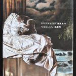
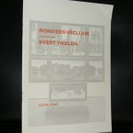
He is called the master of the multi pannelled painting and i do not doubt it, because his technique is phenomenal. I have followed the career of Thielen from the very first moment i first saw a painting of his he presented to my old school. They had, if i remember well, their 75th anniversary and he had made a painting of the school facade.  It looked like the real thing. great perspective, nice colors, but to me it looked very much like a clone of the best facade Carel Willink could do with textures and colors. But from that moment on his career took off  with exhibition in the Netherlands and abroad. In the process he developped a style of his own and was one of the few in the Netherlands that could paint a truly large canvas. In many cases devided over multiple panels. This is not my kind of art i would like to have in my collection, but one must admire his paintings for their realistic qualities they undoubtedly have.


www.ftn-books.com has some nice Thielen titles available

Posted on 12 Comments

Arranz Bravo and Rafael Bartolozzi stand for italian Pop Art.

Schermafbeelding 2019-02-14 om 16.02.18

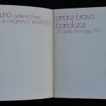
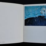
Every country in the world was at some time during the Sixties and Seventies influenced by the american Masters of Pop Art. In the Netherlands there were Woody van Amen and Tajiri. In France there were Monory and Raysse. Germany has Dieter Hesserer and Italy they had Arranz Barvo and Rafael Bartolozzi. They worked together and made some great paintings at that time, but now….many of these artists are almost forgotten. This does not mean that their works are of no importance, but at the moment these are not “In VOGUE”. It is a litlle like it was some 30 year ago. Zero/Nul and Kinetic were thought of no importance, but now….every collector in the world wants its share of the ZERO art and not much is available at reasonable prices anymore. I predict that it will be the same with…. first POP ART from outside the US and later after the art market has devided all good Pop Art…. it will be time for Minimal Art. These are my tips for the future if you want to build a collection that gathers value over the years to come. www.ftn-books.com has some great books on Pop art and Minimal Art available but also the Bravo/Bartolozzi catalogue including the invitation they made for one of their first exhibitions at IL FAUNO in Torino.

bartolozzi a

Posted on Leave a comment

L wig Mies van der Rohe (1886-1969)qΩ“Ω~ |’| §

Schermafbeelding 2019-02-14 om 15.19.14

When i think about Ludwig Mies van der Rohe, three of his designs i remember instantly. The first …a chair by Mies van der Rohe, One i always wanted to own and when i finally had one i did not think it was comfortable enough so i sold it. The chair… a Barcelona chair.

Schermafbeelding 2019-02-14 om 15.16.32

The one he designed for the Barcelona Pavillion. It was designed for the World exhibition from 1929 and after the exhibition it was demolished, but a group of spanish architects recognized its importance and had it rebuild in the Eighties from last century. I finally had a chance to see it for myself when i visited Barcelona for the first time around 2005. We walked over there since it is only a 10 minutes walk from the Fundacio Joan Miro.

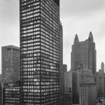
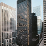
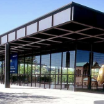
The last one is the Seagram building which is one of the skyscrapers i admired when i first visited New York together with my father. A building i remembered well and of which i recognized style elements when i visited the Neue Nationalgalerie in Berlin some 30 years later. Ludwig Mies van der Rohe is a force in design and has made his mark on many of last centuries greatest designs. Some of his classic publications are availabel at www.ftn-books.com

œcv

¿≥

Posted on 17 Comments

Theo Eissens (1952-2015)

Schermafbeelding 2019-02-14 om 14.44.10

I had never heard of Theo Eissens until i received the catalogue by Eissens SPRING BRUNNEN, which is now available at www.ftn-books.com. He photographs his surroundings and alters it by putting colored grids as an overlay on his photgraphs. It makes the works having a typical Eissens signature.

The catalogue which is for sale is the 2008 catalogue, but on 22 March 2015 the exhibition Theo Eissens – Berlin Calling opened at the Livingstone gallery with a series of new works: unique silkscreened images on canvas of abandoned and burdened places in and around Berlin.
Berlin played an important role in the life of Theo Eissens (Amsterdam 1952-2015). The title of this publication refers to the frequent trips he made from Amsterdam to Berlin and vice versa, and the recurrent long and short periods he lived and worked there, starting in 1992.
He worked at the Bethanien ( the same place as RONALD DE BLOEME worked at ) and exhibited with artists like A.R. Penck and Bruce McLean (1996, Galerie im Parlement, Druckwerkstatt Bethanien, Berlin) and was able to immerse himself in German (art)history.


In 2004 his focus shifted from prints on paper to works on canvas and wood panel. His ‘new’ concept involved photography combined with abstract and geometric shapes in acrylic paint. His extensive experience with printing techniques enabled him to use a silkscreen to literally transfer a photograph onto canvas and merge the image with parts painted in acrylic.
This development in his work led to the 2008 catalogue and exhibition Spring Brunnen. .

In 2015 Theo Eissens died unexpectedly, leavind us an important but small collection of impressive art works.

eissens.jpg

Posted on 27 Comments

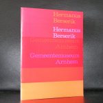
Hermanus Berserik (1921-2002)

Schermafbeelding 2019-02-12 om 17.05.30

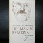
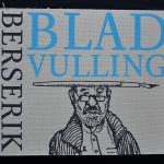
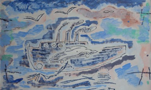
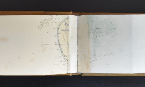
I just thought about Berserik, because i lay my hands on one of the most intimate publications by an artist . It is the facsimile published BLADVULLING book by Hermanus Berserik full of sketches by this artist. He painted daily life scenes and was very fond of his sailing boat, which he depicted numerous times together with other nautic themes.

Schermafbeelding 2019-02-12 om 17.11.27

You can still encounter his works at reasonable prices at auctions and his etchings can even be called CHEAP. If you do not know anything about the artist just visit:

Hermanus Berserik | De wereld onder een stolp

where a Berserik exhibition was held until the 18th of January. It gives some excellent in formation. The other way to get informed i to look for publications on the artist. www.ftn-books.com has several Berserik titles available.

BTW. I just learned at the MORE site that Berserik was an ex cellent photographer too.

Posted on Leave a comment

Tamara de Lempicka (1898-1980)

Schermafbeelding 2019-02-12 om 16.53.26

Two aspects of her art life spring to mind. First and foremost a great Art Deco painter and one of the frist female artists being recognized by the greater public as a great artist and secondly …she depicted the “beau monde” in the Interbellum. The period between WWI and WWII.

Although she was born in Poloand she spent her working life in France and the United States. She is best known for her polished Art Deco portraits of aristocrats and the wealthy, and for her highly stylized paintings of nudes.

Schermafbeelding 2019-02-12 om 16.53.47

Born in Warsaw, Lempicka briefly moved to Saint Petersburg where she married a prominent Polish lawyer, then travelled to Paris. She studied painting with Maurice Denis and André Lhote. Her style was a blend of late, refined cubism and the neoclassical style, particularly inspired by the work of Jean-Dominique Ingres.[1] She was an active participant in the artistic and social life of Paris between the Wars. In 1928 she became the mistress of Baron Raoul Kuffner, a wealthy art collector from the former Austro-Hungarian Empire. After the death of his wife in 1933, the Baron married Lempicka in 1934, and thereafter she became known in the press as “The Baroness with a Brush”.

Following the outbreak of World War II in 1939, she and her husband moved to the United States and she painted celebrity portraits, as well as still lifes and, in the 1960s, some abstract paintings. Her work was out of fashion after World War II, but made a comeback in the late 1960s, with the rediscovery of Art Deco. She moved to Mexico in 1974, where she died in 1980. At her request, her ashes were scattered over the Popocatépetl volcano. www.ftn-books.com has one nice publication on Lempicka

lempicka

Posted on Leave a comment

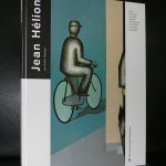
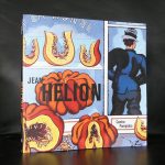
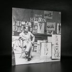
Jean Hélion (1904-1987)

Schermafbeelding 2018-10-10 om 11.46.44

Try to find a good portrait of Jeran Helion and you will have a hard time finding one. There is one possible explanation and that is that Jean Hélion was a modest artist. I read a little on him and he lived for his art , developing his style into a recognizable style of his own. Helion is mostly known in France , but some of his paintings found a way acroos the French border and were presented in other museums too.

In 1921, Jean Hélion moved to Paris, working as an architect’s assistant and frequenting the Louvre. While visiting the museum, he encountered the works of Nicolas Poussin and determined to switch courses and become a painter. By the mid-1920s, Hélion had entered into a milieu of artists that included Otto Freundlich and Joaquín Torres-García. Quickly transitioning from Cubism to nonobjective abstraction, the artist adopted and implemented ideologies culled from artists such as Piet Mondrian and Max Ernst. In 1940, he joined the French resistance army, was subsequently captured, and lived as a prisoner of war for the next two years. Following his release, Hélion rejected pure abstraction in favor of more figurative elements, producing paintings which harkened back to Neoclassical compositions and the works of Fernand Léger. The artist died on October 27, 1987 in Paris, France. Today, his works are held in the collections of the Peggy Guggenheim Collection in Venice, the Tate Gallery in London, The Museum of Modern Art in New York, and the Centre Georges Pompidou in Paris, among others.

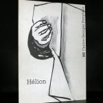
www.ftn-books.com has some Helion publications available

Posted on 13 Comments

Bernard WILLEM Holtrop (1941)

Schermafbeelding 2019-02-11 om 16.07.36

When i compare artist with each other  , the artist that comes to mind is  Pettibon. I think the best way to compare WILLEM is by comparing his drawings with the ones made by Raymond Pettibon.Prins Bernhard comic by Willempettibon brush a

Put them next too eachother and you see a resemblance in the directness and of course the use of black and white within them. But WILLEM is not only known for his Black / white drawings , but also for his political drawings and … some great illustrations. Among them… the illustrations he had done for FROM A -> Z by Rebecca Rass, published by Thomas Rapp in 1969 and available at www.ftn-books.com

rass

Here is a part of the biography on WILLEM published by the Lambiek gallery:

Born and bred in de Veluwe, one of the most conservative regions of Holland, Willem has become one of the world’s most unpredictable and sardonic cartoonists. While studying Fine Arts between 1962 and 1967, it all started with some early comix and cartoons for magazines like De Legerkoerier (The Army Courier), and with Willem’s contributions to the legendary student magazine Propria Cures. There, he got in touch with Roel van Duyn, the editor of the paper for the hippie movement Provo.
Since Provo at that time didn’t have an illustrator, Willem started working for them right away. In 1966 he caused quite a stir by portraying the Dutch queen Juliana as a prostitute in one of his cartoons for the Provo publication God, Nederland & Oranje. What followed was a persecution for lese majesty and a fine of 200 guilders. Following the demise of the Provo movement, his work appeared in De Nieuwe Linie in 1967. He moved to Paris, France in the following year, where his first cartooning work were contributions to L’Enragé during the May 1968 student strikes in Paris.

He subsequently became a regular contributor to Hara Kiri as well as its follow-up Charlie Hebdo. Willem’s beloved themes such as fat women, biological warfare, crabs, small children and police violence were all represented in the many political cartoons, illustrations, puzzles, comix and texts for the magazine. He also served as a promotor of Dutch comic abroad with his own publication Surprise. He was eventually editor-in-chief of Charlie Mensuel. He also appeared in Benoît Lamy’s documentary ‘Cartoon Circus’ (1972), a Belgian documentary about cartoons and comics,  in which he was interviewed alongside SinéPichaRoland ToporCabuJean-Marc Reiser, François Cavanna, Professeur Choron, GalGeorges Wolinski, Joke and Jules Feiffer.

Ever since the late seventies, Willem has been contributing controversial daily cartoons to the French left-wing daily Libération. All through these years his output has been prolific, resulting in a veritable mountain of book publications, which are almost without exception hard to find. Luckily, in 1998, the editor Jean-Pierre Faur published the anthology ‘Deadlines’, a beautiful overview of the works of one of the most internationally renowned Dutch graphic artists.