Posted on Leave a comment

Oliver Boberg ( 1965 )

Schermafbeelding 2018-12-01 om 14.40.47

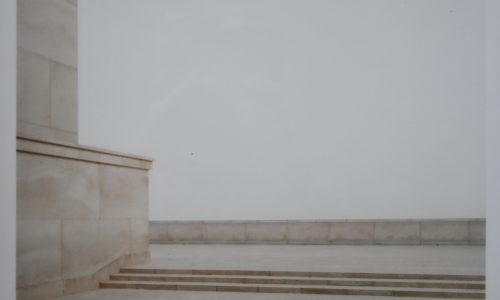
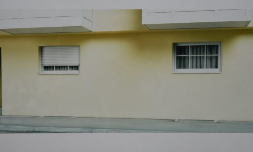
The first time i was confronted with the work by Oliver Boberg was when he had  a large Retrospective exhibition. This was in 2004 at the Fotomuseum and i was very much impressed. Specially the large scale photographs had a feel of desolation and now i have bought for FTN Art two of his greatest photographs at a much smaller scale but still these are originals and very well worth collecting. The book i had on Boberg was sold years and years ago, but this is even better for the true admirer. The photographs are both from a very small edition of 20, numbered and signed and in pristine condition. Framed in a quite expensive frame and come from a collector from the US.

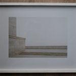
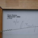
Memorial by Oliver Boberg , 2002,  edition 20, number 14/20, C-Print and signed by Boberg.

Frame measures 51 x 42 cm. C print is 35 x 25 cm. , condition is MINT

boberg memorial a


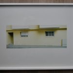
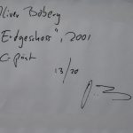
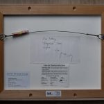
“Erdgeschoss” by Oliver Boberg , 2001, edition 20, number 13/20, C-Print and signed by Boberg.

Frame measures 51 x 42 cm. C print is 38 x 15 cm. , condition is MINT

boberg erdgeschoss a

Please visit the FTN art section on this page for more information

Oliver Boberg was born in Herten, Germany, in 1965. He studied art history at the University of Würzburg, Germany, from 1985–86, before transferring to the Art Academy Nürnberg to study painting from 1986–93. Since 1997 Boberg has garnered attention for his photographs of what appear to be bleak, uninhabited architectural sites but are in fact models constructed by the artist in his studio. The sense of neglect that haunts these scenes contradicts the painstaking meticulousness applied to their fabrication. In Boberg’s work from the late nineties, the elegant formalism of his compositions contrasts with the subject matter—color-drained stairwells, roof decks, and building facades painted to dissemble age and dilapidation. Works such as Park (1998) and Playground (2000) offer barren sites of disrepair despite their sunny titles. Boberg created his first films for the series Night Sites (2002–03). In these films, the artist utilizes familiar Hollywood devices—fluorescent blue lighting that typically permeates suspenseful night scenes and eerie settings like an abandoned alley or fog-coated forest—to promise a drama that never unfolds. In 2003, with his Building Shell series, Boberg returned to his characteristic photography of elaborate models, this time recreating multistory edifices in the midst of the construction process. In 2004 the artist began to work for the first time with black-and-white photography for his Pagesseries. In Pages and Walls (2007), Boberg revisited his photographic investigation of highly constructed, formalist sites of inattention. Inattention gives way to tragic neglect in his series Slums, begun in 2008, which focuses on the derelict makeshift dwellings composed of serrated tin and other urban debris. For this series, the artist juxtaposed his photographs with computer-generated drawings.

Solo exhibitions of Boberg’s work have been organized by the Museum of Contemporary Photography in Chicago (2001), Musée de l’Elysée in Lausanne (2002), Kunstverein Hannover (2003), and Duolun Museum of Modern Art in Shanghai (2005). His work has also been included in major group exhibitions such as Experiment at the San Francisco Museum of Modern Art (2000), Moving Pictures at the Solomon R. Guggenheim Museum in New York and the Guggenheim Museum Bilbao (2003), and Artist’s Choice: Herzog & De Meuron, Perception Restrained at the Museum of Modern Art in New York (2006). Boberg has been recognized with the Bayerischer Staatsförderpreis für junge Künstler, Fotografie (1997) and Förderpreis für bildende Kunst der Stadt Nürnberg (2005), among other awards. Boberg lives and works in Fürth, Germany.


Posted on Leave a comment

Dennis Bailey (1931-2016) a prominent British graphic designer

Schermafbeelding 2018-09-04 om 14.56.33

It was just recently that my eye was caught by a cover for a British exhibition on Architecture. ( available at www.ftn-books.com) The exhibition “ARCHITECTURE TODAY, has over 140 page filled with examples of typical Sixties architecture but what made it stand out for me was the excellent cover by Dennis Bailey.
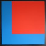
architecture today

Bailey was of great influence to other British designers because he taught at the Central School Of Art & Design (1957-60), Chelsea School of Art (1970-81) and at Middlesex Polytechnic during the late 1980s.
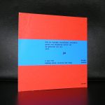
I wondered why i find his design so appealing. It must have been the influence of Swiss design . at least there is a hint Gerstner in his designs and it is no wonder, because he contributed for a period of over 20 years to GRAPHIS magazine based in Zurich.

For more information on this great Britisch designer please read the article that i found over here:

Remembering Dennis Bailey – design’s unassuming statesman

Posted on 14 Comments

Konrad Klapheck (1935)

Schermafbeelding 2018-09-03 om 15.12.57

It is still not clear to me if i should call the art by Konrad Klapheck the german equivalent of Pop Art or German realism. …Just tell me what you think yourself?

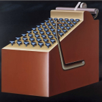
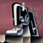
Fact is that his art is highly recognizable and emerged in an era where ordinary items like typewriters and teakettles were blown up, abstracted and enhanced and painted on canvas. The art of Konrad Klapheck could be described as a typical “east german” kind of art the use of green and brown are very present in his paintings, but where this comes from is not clear, because he was born , raised and even studied in Dusseldorf. But his use of these specific colors makes this not the happy kind of Pop Art like the Pop Art of the Americans or the French, but a restrained kind of Pop Art. His subsequent paintings, often large in scale, are precise and seemingly realistic depictions of technical equipment, machinery and everyday objects, but strangely alienated; they are “monumental, amusingly absurd and sexually suggestive”.

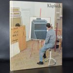
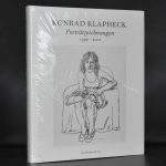
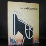
Klapheck’s subjects through the years have included (in order of introduction) typewriters, sewing machines, water taps and showers, telephones, irons, shoes, keys, saws, car tires, bicycle bells and clocks. Influenced by Duchamp, Man Ray, and Max Ernst, Klapheck’s “ironic treatment of everyday mechanics” prefigures Pop art in its magnification of the trivial. www.ftn-books.com has some Klapheck titles available

Posted on 9 Comments

Tineke Griffioen retires on 12/1/2018

tineke sepia

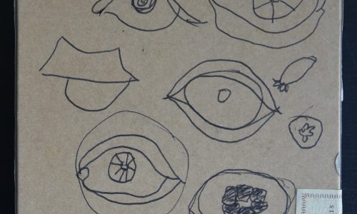
Finally, after 43 years of being one of the most loyal and dependent employees of the Gemeentemuseum  Den Haag, Tineke Griffioen decided to retire from her jobs at the museum. From Prentenkabinet to DTP she made not only a career within the museum, but was also very much involved into the well being of her colleagues. The museum will miss this very friendly and dependent employee who had an expertise in prints and drawings. The set depicted in this blog comes from a Siep van den Berg sketch book he made in France in 1990 and shows that the following pages from the book were not accidentally filled in, but that each drawing developed into a very nice Constructivist composition. This very set was presented to Tineke for being the colleague that she has always been to me….Thank you and have a great retirement!

tineke berg

PS. Other sets are available at www.ftn-books.com , Please inquire

Posted on Leave a comment

Giovanni Nicolai ( continued )

Schermafbeelding 2018-11-27 om 07.25.44

This is to announce that FTN Art will represent Giovanni Nicolai with his art work.

From now on a selection of his art will be available in the FTN Art section of these pages. Feel free to contact me if you want more information. The start will be  a series of affordable sketches at euro 150,–. Executed in different techniques with Crayon , pencil and paint on paper. If you desire information on his paintings please sent me a mail and i will propose you  a selection of paintings currently available.

Posted on Leave a comment

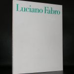
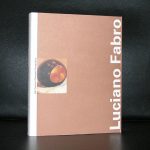
Luciano Fabro (1936-2007)

Schermafbeelding 2018-09-02 om 11.31.47

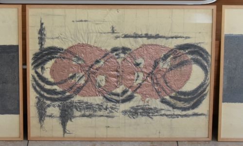
Luciano Fabro…an italian artist rooted in the ARTE POVERA and perhaps a little bit forgotten nowadays.

But Fabro stays very imortant for Modern Art, since his works are very much in line with other great artist from that era. Castellani and Manzoni were of great influence to him and in 1958, after he saw Lucio Fontana’s work at Venice Biennale, Fabro moved to Milan where he spent the rest of his life pursuing his artistic career.

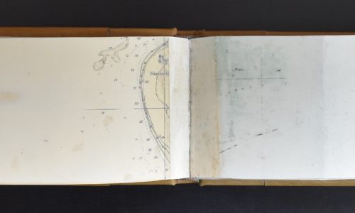
Fabro was involved in the Arte Povera group, which was interested in experimenting with industrial and natural materials, focusing on process, language and the body. Fabro’s best known works were sculptural reliefs of Italy made out of glass, steel, bronze, gold and even soft leather. The signature unorthodox, ‘poor’ materials in his works include steel tubes, cloth, newspapers, and wax; the artist, however, often used also traditional and expensive art materials such as gold, marble, and bronze. At the height of the ARTE POVERA group, the Boymans van Beuningen Museum organized and exhibition with the works by Luciano Fabro and after this exhibition other exhibitions followed in the Netherlands. The catalogue is available at www.ftn-books.com
Posted on 14 Comments

Felix Labisse (1905-1982)

Schermafbeelding 2018-08-31 om 17.08.22

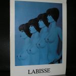
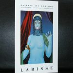
Felix Labisse, is for me one of the great surrealist painters from last century and i have a life long admiration for the artist and his works.

It must have been around 1970 that i visited in the company of my parents Paris. I started to grow an interest in art and limited editions because i had a membership with ARTA . a small gallery with a subscription program to buy at membership prices graphic art. My entire collection at that moment well below 5 lithographs.

Paris it was and beside the scenic neighbourhoods , museums and tourist attractions we went to shop at “galerie Lafayette”. We took the escalator and on the top floor …there it was . a true ART gallery and the first piece on show was this lithograph in a signed edition.

Schermafbeelding 2018-08-31 om 17.07.31

I was so impressed with the lithograph that i borrowed the money with my father to buy it and since it has been in my collection. I still love the beauty of the typical Labisse female figures. It is not on the wall anymore, but is still very much appreciated as a wonderful piece of art that i cherish for being a Labisse and for being one of the first pieces of art that i ever bought.

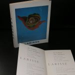
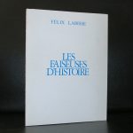
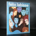
www.ftn-books.com has some nice Labisse publications available

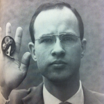
btw. The beautiful portrait of Labisse sitting is by Brassai


Posted on Leave a comment

Nicolas de Stael (1914-1955)

Schermafbeelding 2018-09-02 om 10.49.45

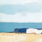
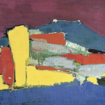
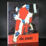
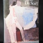
Another artists artist is Nicolas de Stael. You can find some of his works in french museum and possibly there are some works in the Netherlands in collections, but the main part of his paintings that are in public collections can be found in French museum, because in France de Stael is known.  Undeservedly de Stael has not become the great name in art he deserves to be. He should be known worldwide , because his abstract art is a highly personal voyage through the landscape of Modern Art. In his short life he experimented with lyrical geometric abstract forms , using less prominent colors than many of his contemporaries.

Every decade there is another large retrospective exhibition in which is tried to explain the importance of de Stael, but so far without success. Still it is neccessary that curators from all over the world present again and again this groundbreaking atist until the greater public becomes familiar with his kind of forms , shiftings and paintings and starts to appreciate this great artist. Preferably not in a way that in every household a reproduction is hung on the wall because it is fashionable to have a “DE STAEL’ on your wall, but in a way that a large public can grow accustomed  to and appreciate this great artist. to start….

www.ftn-books.com has some great titles available

Posted on 6 Comments

Bob Bonies (1937)

Schermafbeelding 2018-09-02 om 10.10.41

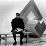
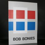
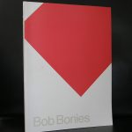
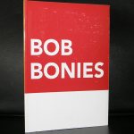
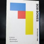
For me the only true “Hard edge” artist in the Netherlands is Bob Bonies, however Michiel Morel refers to the art of Bob Bonies as a rearrangement of FORMS AND COLORS.

I read his excellent article and it is unfortunate that it is only available in dutch, but for those who understand the language here is the link :

Bonies: Ordening van vorm en kleur (periode  1964 – 1968) (3)

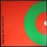
As you can read in the article . Bonies stayed true to his art of rearranging , shifting and placing forms and colors in a new context and one of the earliest silkscreen that was published in a larger edition was the one he made for the Stedelijk Museum catalogue VORMEN VAN DE KLEUR

in which his contribution stands out together with the one Ellsworth Kelly made for the same publication. This Wim Crouwel designed publication is available at www.ftn-books.com

left Bonies and right Kelly

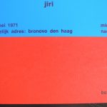
I have a lifetime admiration for Bob Bonies. He was one of the first artists i personally met at the Gemeentemuseum and a few years ago i bought a small collection of his publications from another bookdealer who had bought them from a Bonies collector and within one of the publications i found the birth card of his son Jiri. Even this card shows the quality of his works. The card is for sale too together with many other Bonies publications.


Posted on Leave a comment

The artists in the world ……

Schermafbeelding 2018-09-02 om 10.22.02

The artists in the world …a never ending art trip

https://www.artistintheworld.com

Above the site location which contains over 4000 photographs now of visited artist all over the world. All photographed in their studios with their back to the camera and link(s) to their internet pages. A fascinating story and one that i visited frequently because of the blogs i am writing. Many of these artist are known to me too. Some of them i visited myself in their studios, but many of them are represented in my inventory at www.ftn-books.com

Schermafbeelding 2018-09-02 om 10.23.08