Posted on Leave a comment

Memphis…no not the city in the US!

memphis veur

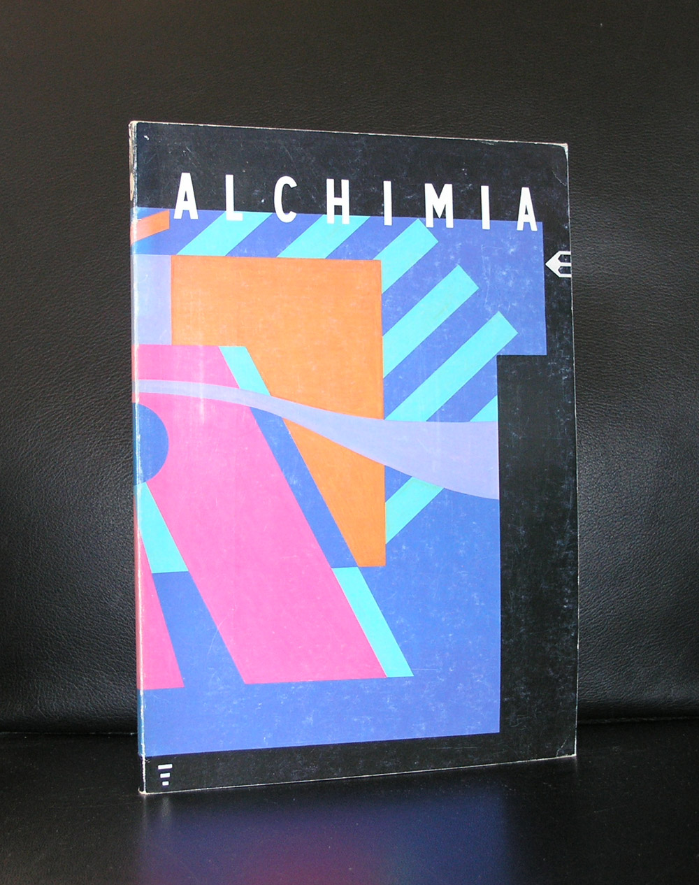
This is a blog on Memphis as a design and art form. Memphis was born in 1982 in Italy in Milano and founded by ao Ettore Sottsass. They designed Postmodern furniture, fabrics, ceramics, glass, and metal objects from 1981 to 1988. and were of great influence to many designers started their careers in those days. The design ideas by Memphis spread all over the world and culminated possibly in one building ….the Groninger Museum. Memphis designs are known for us dutch by one gallery shop in Den Haag who presented all these artists and had many specials an limited editions from the Memphis group. The COPI shop in the Prinsenstraat / Den Haag does not exist any longer but ask any dutch collector interested in Memphis, they know the name for sure. Because of the blog i finally know the origin of the name and found it on Wikipedia and want to share this information with you:

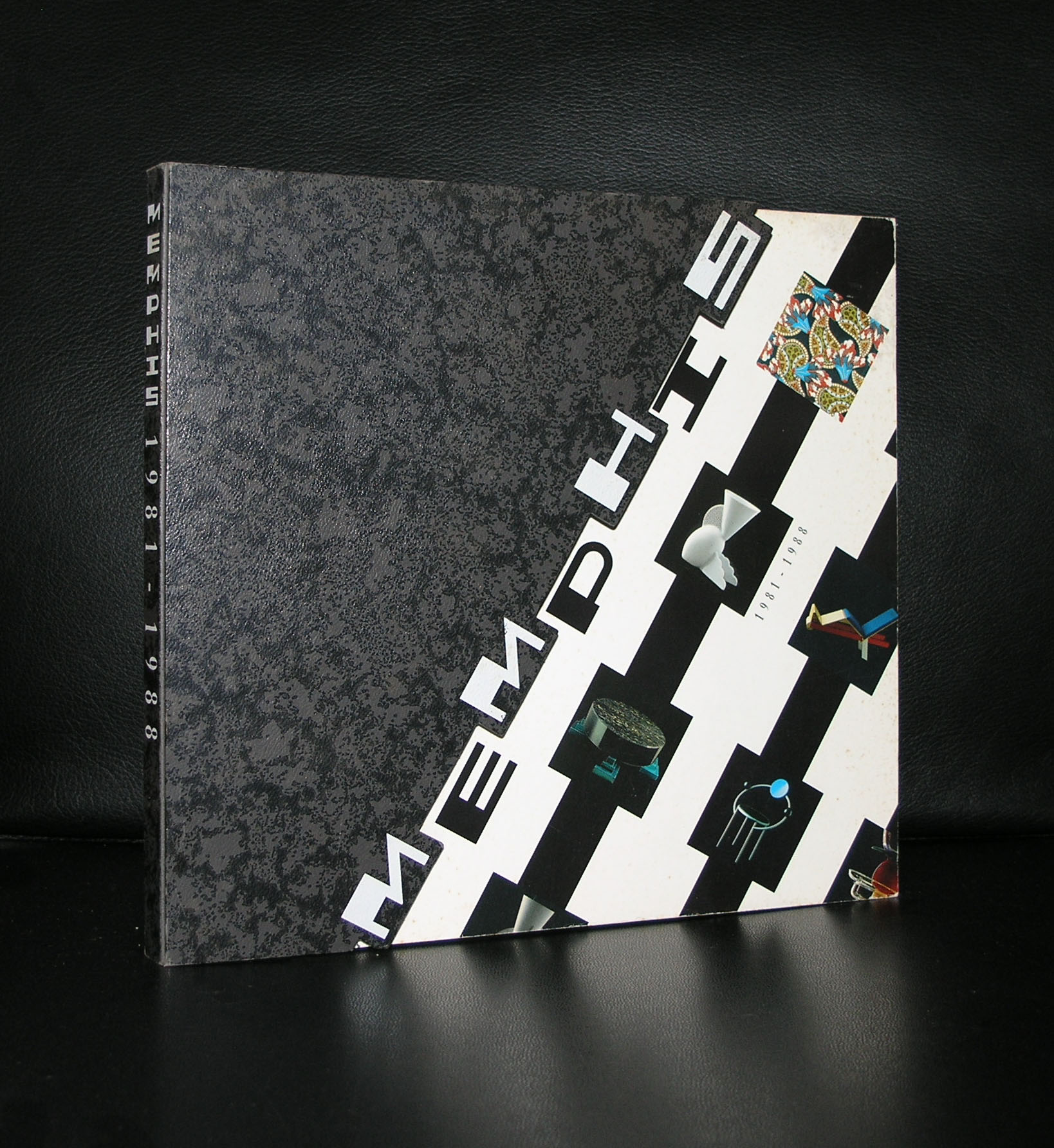
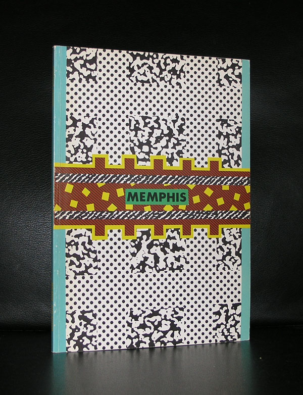
On December 11, 1980, Ettore Sottsass organized a meeting with designers, and in 1981 formed a design collaborative named Memphis. The name was taken after the Bob Dylan song “Stuck Inside of Mobile with the Memphis Blues Again” which had been played repeatedly throughout the evening’s meeting. They drew inspiration from such movements as Art Deco and Pop Art, including styles such as the 1950s Kitsch and futuristic themes. available at www.ftn-books.com are the following Memphis publications.


Posted on 8 Comments

Kyungwoo Chun (1969)

Schermafbeelding 2018-01-31 om 13.55.08

I had never hear before of this Korean born artist, but since we have a Korean painting by Jungwook Kim in our collection i have become interested in Korean Modern Art. Last week i encountered this publication on our local bookmarket and immediately my interest was raised . Intriguing portraits of blurred persons create a fairy tale like atmosphere. I find this photographs of high quality and if i triggered your interest pleasde visit his site at: www.kyungwoochun.de

Schermafbeelding 2018-01-31 om 13.53.08

Born in Korea, now based in Germany, Kyungwoo Chun is known for his softly controlled treatment of his subjects. Much of Chun’s photographic work is deeply figural and plays with the standards of traditional portraiture. Since his first solo show in 1994, Chun has exhibited heavily in his home country, as well as across Europe and beyond. Chun also works in performance and video. Much of his highly interactive performance work engages directly with public space and site-specificity, and uses the viewers as crucial elements in the work, whether they are writing text, folding paper airplanes, or simply touching it. In Versus (2011), Chun installed a curving, minimalist bench in the heart of Times Square, then filled the structure with two facing rows of people. For the run of the piece, opposing participants gently leaned on one another, in a partial-hug of an embrace. Video functions in several ways for Chun. At times, the moving camera does the same as stills, blurring figural forms into abstracted color and shapes. At others, the videos serve as essential documentation of performances that are only activated by an audience of participants who drive the work. Chun’s work has been exhibited at institutions such as the Museum of Photography in Seoul, the Center for Contemporary Art in Aarhus, the Kunstverein Ruhr in Essen, and the Museum of Fine Art Houston.

www.ftn-books.com has one book on this artist available

chun


Posted on Leave a comment

A very special Wim Couwel publication for the H.N. Werkman 1964 exhibition

Some combinations are hard to beat and this one is surely a classic. Wim Crouwel was not yet promoted to the position of designer of the catalogues of the Stedelijk Museum Amsterdam and had just left the van Abbemuseum with his designs. In the in between period he did some free lance works and one of these was the catalogue he designed for the H.N.Werkman exhibition of 1964 in the Groninger Museum and this catalogue became the standard for all his future designs. He chose a slim sized catalogue, but within the book he used some of the papers which he had used in the van Abbemuseum catalogues and would use again for the Stedelijk Museum catalogues. Making it simple but still complex.

On the cover a bold and typical Werkman print which emphasized the graphic quality of the catalogue. The back…. a typical red with clear black and white lettering. This is in my opinion one of the very best graphic designs ever made in the Netherlands and i am proud to still have a copy for sale of this beautiful and splendid Wim Crouwel catalogue.

For this catalogue please visit www.ftn-books.com

Posted on Leave a comment

Kenneth Martin (1905-1984)


Schermafbeelding 2018-01-30 om 11.50.13

Kenneth Martin was for me one of the grand old masters of Constructivism. Outside England hardly known, but considered by many of great influence and importance. His best works for me are his prints in which he excels. His wife Mary was a gifted artist too and from both www.ftn-books.com has some nice publications. I only know of one exhibition outside Great Britain, which is the Bottrop exhibition but when you see one announced , i strongly recommend a visit to discover yourself the importance of Kenneth Martin.


Posted on Leave a comment

Ossip, Winter and Chezhin

There different artists, 3 different backgrounds, 3 different era’s, but somehow their works have a resemblance with each other. The source is with all three an old photographs, which is worked over in a way the scene becomes surreal.

Above are some of the examples i found in my inventory of www.ftn-books.com , which has pubications of all three artists available.

From left to right: Ossip, Julie Winter and right Chezhin.

Chronologically and artistically there is for me no doubt who is the most original of these three……by far it is my friend OSSIP, who’s art is still developing . His “sculptures”are literally on the move nowadays.