Posted on 2 Comments

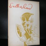
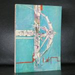
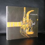
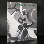
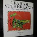
Graham Sutherland (1903-1980)

Schermafbeelding 2019-04-16 om 11.36.28

When i looked for information on Sutherland I found this excellent article on the WIDEWALLS site.

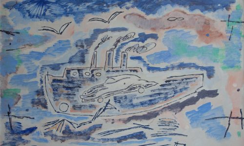
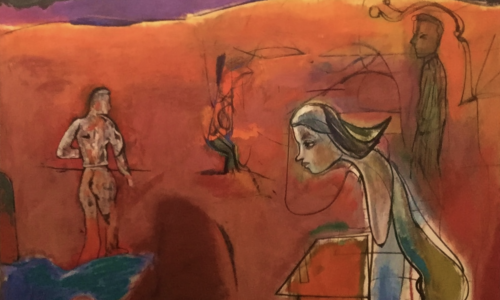
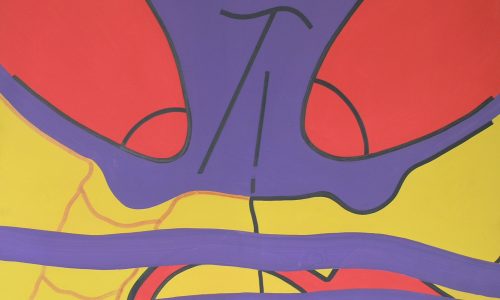
One of the leading British artists of the 20th century, Graham Sutherland was widely known for his prints and paintings. Despite some other names coming to mind before him when talking about the art history, such as David HockneyFrancis Bacon, or Lucian Freud, there was a time when Sutherland ruled undisputed. From mid-1930’s, when he established his identity as a modern painter, to the 1950s, when his influence began to wane, there was a widespread consensus amongst fellow artists and critics that Sutherland was the most exciting and compelling voice in contemporary British painting.[1] He was even commissioned to paint a portrait of Winston Churchill, in what turned out to be one of the most famous cases of the subject disliking the artwork, which eventually led to its destruction.

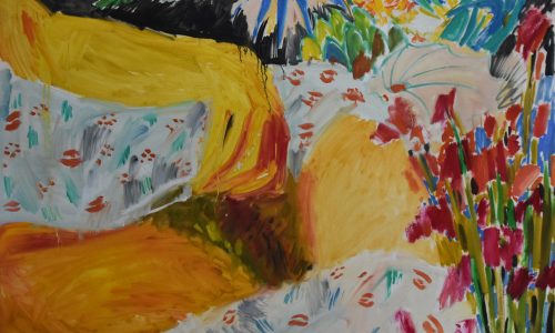
Sutherland’s artistic career included several significant changes in direction. After specializing in engraving and etching, he began achieving fame as a printmaker. His early pastoral prints display the influence of the English Romantic Samuel Palmer, whereby prefiguring Sutherland’s later involvement within the Neo-Romantic movement in Britain. However, the famous 1929 Wall Street Crash bankrupted many of his collectors, thus forcing Sutherland to turn to other sources of income. He worked as an illustrator until he visited Pembrokeshire, becoming completely captivated by it, and subsequently, turning to painting as a primary medium for his expression. The artist continued to draw inspiration from Pembrokeshire countryside and its enthralling anthropomorphic natural forms for the rest of his life.[2] When working on landscapes, Sutherland’s working method included seizing on a detail such as a dead tree, boulder, thorn bush, everything that according to the artist, required a separate existence. He would sketch this on the spot, and later a studio painting would evolve. Sutherland wasn’t the first to do so – many landscape artists before him had done pretty much the same, but his studio hand moved considerable further from what his outdoor eye had seen. Neo-romantic at the core, his work inspired others such as Paul NashJohn Craxton, and John Piper. Over time, Sutherland began to reveal himself as a vivid colorist with an original sense of harmonies. He somewhat banished the dark and heavy tones which he had used earlier, though preserving the sharp black and white oppositions and using acid pinks and mauves, orange and light blue, emerald, chrome yellow, and scarlet.

www.ftn-books.com has some nice Graham Sutherland titles available


Posted on Leave a comment

the early Andy Warhol (1928-1987)

Schermafbeelding 2019-04-15 om 13.40.39

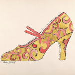
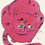
Andy Warhol is known for his Pop Art and Factory years mostly, but at one time there was an early Andy Warhol . An artist who tried to survivve by taking up illustration jobs and what i personally like about these years is that his art is more poetic, you can even call it “sweet”. Cats, boots, lace everything that was in later years not used as an art object you can find in these early years.

Perhaps artistically these are not the strongest years of Warhol as an artist  and certainly not the most appreciated, but his drawings are very detailed and in some cases amazing. The cats and shoes are lovely, but for me nothing out of the ordinary. But how about these 2 heads…one a detailed pen drawing the other almost the saem but filled in with gold leaf, making it a spectacular drawing and a drawing to admire.

Schermafbeelding 2019-04-15 om 13.41.04

There are not many books on these early years available, but there is one i can truly recommend. It is a german catalogue for an exhibition held in 2000 in the Hamburger Hof, where the Marx collcetion of early Warhol was presented. The book is availabel at www.ftn-books.com

warhol marx

Posted on Leave a comment

Zero art in the Seventies …a thought

Schermafbeelding 2019-04-15 om 12.28.40

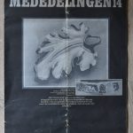
Yesterday i added the MEDEDLINGEN nummer 14 magazine by the Centraal Museum Utrecht to my inventory. It was a special about Carel Visser and NUL/ ZERO. The article on Zero was an eye opener. The museum decided not to collect Zero art anymore, because they thought they had enough by the Informele and Zero artists already and they considered the ZERO mouvement not important enough to follow the ZERO artists longer. Zero was “history” they concluded.

Now 43 years later time has proven the Centraal Museum wrong, since ZERO, together with Minimalism, hav proven to be major and highly important mouvements in Art and it is likely that these mouvement will grow in importance in  the decades to come.

Posted on Leave a comment

Luc Claus (1930-2006)

Schermafbeelding 2019-04-15 om 12.09.54

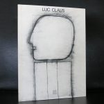
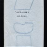
Claus was a very gifted Flemmish artist who had one specialty… he made almost exclusivily drawings and within these drawings he rarely used color. This made his work highly recognizable and because of the size of the drawings , some very nice publications were published. These artist books have now become very desirable and highly collectable books and www.ftn-books.com is lucky to have several titles available.

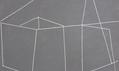
Claus was a master in creating an empty space with just a single form within. One of his favourites was a head on a rectangular plinth. With this drawing he creates an image of a sculpture but which was `ctually just a 2d drawing. Claus left about 30 sketchbooks in which it is made clear how he searched for abstraction.

Posted on Leave a comment

Stuttgarter Hefte IIII… also in the Moma collection

stuttgarter a

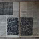
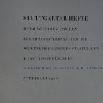
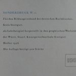
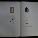
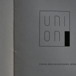
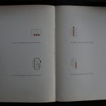
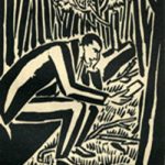
I am proud to have finally found one of these iconic publications by the Staatliche Kunstgewerbeschule Stuttgart. It was a lucky find, but still one i have been looking for for for many many years in the past. The location was secret for many years because it was protected by another book which i recently had bought and which is roughly from the same date. It must have been the former owner who knew its value and wanted to protect the precious publication. These Stuttgarter Hefte were published in only 400 copies in the mid Twenties and printed in the printing rooms of the Kunstgewerbeschule. Everything is special about these publications. Sizes are far larger than usual. The lay out is impressive and the designs are true avant-garde for those years. This one was printed in 1926 and as said in an edition of only 400 copies. I am sure that only a few have survived over the years and most of these have found new owners or are in important libraries. I found the set being a part of the MOMA collection and when i tried to find other copies on the internet….. i found as expected…. ZERO of them. Now this excellent copy is for sale. On a scale of 1 to 10 i would rate this one at 8+ points

Pictures tell a better story so here are some of the pages an designs of this truly remarkable publication.

Posted on 1 Comment

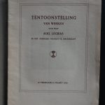
the oldest Stedelijk Museum i have in stock is on Aug. Legras

legras e

To be honest … i had never heard of Legras before, but the catalogue is impkrtant enough to add it to my inventory. Since this is rare. Published in a time that the world was at war and the Netherlands was neutral. What struck me, is that like many of his fellow artists Legras was charmed by North Africa. he visited countries and villages and translated his observations into drawings and paintings. This catalogue is special and a very welcome addition to all who collect the Stedelijk Museum catalogues.

legras sm a

Posted on 1 Comment

Akio Suzuki (1941)

Schermafbeelding 2019-04-14 om 14.32.33

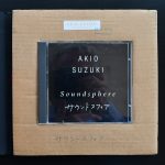
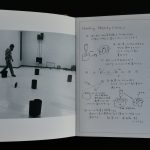
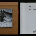
It was the Apollohuis who introduced Akio Suzuki to a dutch audience and since i have been following Suzuki. Finally i have found another copy of the Akio Suzuki Soundphere cd package that was published in 1990 by HET APOLLOHUIS. The package contains a booklet and a cd  and is one of the hardest to find of all Suzuki publications.

Tracklist

suzuki sound a

Born in 1941 in Pyongyang, Korea to Japanese parents, who moved their family back to Japan when he was four, Suzuki grew up in the Aichi prefecture, near Nagoya. After initially studying architecture, he turned toward sound. The ’60s found him in a period of self-study, initiated by the happening Kaidan ni Mono wo Nageru (Throwing Things at the Stairs) in 1963, where he threw a bucket of objects down the stairwell of the Nagoya train station. The movements of the time (Gutai, Fluxus, etc.) created an atmosphere for his experimentation, but Suzuki worked largely alone in the development of his ideas. The sonic details of that initial event—the live, raw sound of those objects falling down the stairwell and the reverberation of the architecture—became a central influence for his self-study, as he worked to follow the sound of the natural and manmade world and to develop ideas that would place him in relationship to that sound. All his work—from live improvisation to installations and instrument design—is based on an interest in the echo. The echo is the perfect example of the temporal continuum of nature. An echo brings the actions of the past into the present (for what is an echo but the mountains responding through repetition?), but also prepares for the future. It is a type of being-in-the-moment, which contains all sonic time.
Of the many instruments that Suzuki has designed, the Analapos is the one he continues to return to in order to further explore the possibilities of the echo. Originally designed in the 1970s, and modelled after a spring reverb, it is based on the design of a child’s toy telephone made by joining two tin cans together with a string, in this case connecting two large metal cylinders by a fifteen-foot spring wire. The Analapos is a cheeky response to the musical zeitgeist of that period; its humour extends to its name, a portmanteau of analog and postmodern. As Suzuki explains, “New technology was developing for music, where the echo became a futuristic thing during that time period.” But his personal interest stemmed from his interest in the natural world. “I used to play with echoes in mountains, then I invented the Analapos.” It is amusing to think that this simple instrument resembling a children’s toy competes effortlessly with complicated electronics designed to add special effects to disco and progressive rock, and that its very acoustic qualities draw from the sublime characteristics of the natural world.
Suzuki has one Analapos that he holds horizontally like an alpine horn to sing through, and a pair that are suspended vertically by a stand, so he can drum on the cylinder lids and the seven-foot spring suspended between them. The metal spring in between the two cylinders amplifies Suzuki’s voice and percussive hits to the cylinders, creating a rich and beguiling reverberation. To witness Suzuki in performance on the Analapos is to witness the way natural reverberation alters sound.
Through performance, Suzuki’s explorations concentrate on the acoustic properties of sound making. It is as if he is bringing nature into the hall—the simple resonance of two stones; percussion that sounds like a rainstorm; echoes like those heard on a valley floor. Suzuki, even at seventy years old, brings attention back to his interests as a child. In conversation he talks about his enjoyment of landscape, from watching from the window of his hilltop birth home in Pyongyang, North Korea to his afternoons spent in his house at Lake Biwa in Japan. “After it finished raining, the water flowed through the garden and I was always watching,” he recalls, “hearing and watching.”
Posted on Leave a comment

Leon Kossoff dies at the age of 92

Schermafbeelding 2019-07-21 om 15.02.57

The following article can be found at the Mutual Art site:

https://www.mutualart.com/Article/Grave-Architecture–How-Leon-Kossoff-Bui/451BDAE66E6E3100?source_page=Magazine&utm_source=MutualArt+Subscribers&utm_campaign=587eaad649-nl_20_07_19&utm_medium=email&utm_term=0_0a9ce6ca24-587eaad649-445942749&ct=t(EMAIL_CAMPAIGN_10_5_2018_13_56_COPY_01)&mc_cid=587eaad649&mc_eid=129d9ef3a9

Earlier in July, British painter Leon Kossoff passed away. Sometime between 1939 and 1943, he entered the local museums at King’s Lynn, the Norfolk town in which the painter spent three years as a wartime evacuee. Here he saw paintings by local brothers, Thomas and Henry Baines, depicting the town’s famous-ish architecture (Daniel Defoe described the place as “well built” in the early 1700s).

This was Kossoff’s first experience of the productive tension between two-dimensional painting and three-dimensional structure; his first intimation of how the flat, framed surface could hold interior space and exterior space at once. It was the experience of leaving London, the buildings which had surrounded him in his native Islington falling away as he left for more rural surroundings, which piqued his interest in architectural painting. A sketch done during this time of the local King’s Lynn Customs House is Kossoff’s first architectural study. Later, he made pictures with oil paint so thick it was more like a built environment than a painted one, allowing the material to fall away from the surface and be rebuilt in waves.

The Baines brothers made technically neat, emotionally sentimental studies of the town’s North Gate, the Kettle Mill, the squat, brick-worked, 15th Century Red Mount chapel. Thomas Baines and others also painted several views of the Greyfriars Tower in Norfolk. The tower stands firm and alone, the only surviving fragment of the Franciscan monastery which was demolished after Henry VIII’s dissolution. Today, it is recognised as the finest among the three surviving Fransiscan monastery towers in England.

Thomas Baines depicts the tower standing proud in the far right of the frame, facing down a blazing wave of nimbus cloud at sunset. The shorter buildings around it are as subservient as the cows in the foreground, lying at the feet of two upright humans. The dominion of man over animal is clear in the painting’s composition, but the tower itself seems to suggest a structural means by which man can reach towards the divine.

To Kossoff’s young mind, the painting would’ve echoed the newspaper images showing blitzed London burning behind St Paul’s cathedral. Much less a case of man challenging the divine, great architecture came to symbolise, for Kossoff and the artists of post-war Europe, the rebuilding of the human soul after the inimitable evils of the holocaust, the blitz and the “moral bombing” of Germany by the victorious allies.

After returning to a bombed-out London, Kossoff began a career of architectural painting, which in turn informed his intimate brand of formal portraiture. The house he had grown up in had been razed to the ground by German bombs, and much of the London landscape underwent significant change in the rebuilding process.

St Paul’s Cathedral became a symbol of London’s resistance, of home-front stoicism, as it withstood the blitz. Kossoff complicates this line of thought with his painting, Small Landscape With St Paul’s (1960), a thick, swathy abstract in monochrome, diminutive in size. It has none of the upright architectural theism of the Baines monastery tower. Through the viscous, massy material of his own grave architecture, Kossoff communicates the difficulty of wading through post-war fallout.

A portrait from the same year, simply entitled Head (1960) has a similar vibe, the low-drooping of the sitter’s forehead seeming troubled, disgruntled, the currents of thick paint dissolving their form into the abstract

By the 1980s and 1990s, Kossoff built up the layers of his paint to a more firmly structural, figurative end. One of his self portraits from 1972 shows the angle of the head inclining slightly in comparison to earlier portraits. Later still, his celebrated portrait of his brother, Chaim, shows a proud and firm sitter, chin raised, hands locked like buttresses, looking down at the viewer. Maybe even a little haughty. It’s not dissimilar, in manner and attitude, from the dramatic perspective of his famous views of Christ Church, Spitalfields.

Even as he builds form throughout the decades, Kossoff’s paintings still always reverberate with some sonorous and unsettling boom, still rush and flow with the headlong motion of time. The sheer drama of a 1990 preparatory sketch for one of his Christ Church paintings is sufficient to show this.

Some of what moves Kossoff’s best paintings, however, is a certain warmth, a faith in the human animal, and an embodied, tangible sensation of London community. Perhaps this is best communicated by his series of swimming pool paintings. Like Kossoff’s paint dripping off the canvas and being reapplied, the water drips from the skins of the bathers. (The heavily-applied oils of many Kossoff or Aeurbach paintings are so thick that they hover between matter-states, half solid half liquid, never truly dry [like an ancient stained-glass window bulging at the bottom]). Similarly, the people captured merge and mingle with the water. Osmosis occurs between their bodies, between the waters, the different kinds of interiority going on here, all suffused with a natural sunlight which glints artificially off the poolwater. There’s a sense of true community, a dialogue between water and structure which includes the human.

Sometimes, things need to fall away to find their form. Kossoff, who built paintings, knew the differences and the non-differences between structure and fluidity, whose fluxes might be the roots of the human soul.

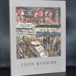
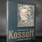
www.ftn-books.com has some nice Kossoff titles available

Posted on Leave a comment

Emmy Andriesse ( 1914-1953)

Schermafbeelding 2019-04-12 om 12.15.40

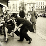
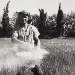
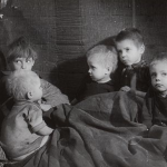
Emmy Andriesse was married to another famous dutch graphic designer. Dick Elffers was her husband and together they formed a formidable and important artistic couple. Where Elffers excelled in design and typography,

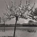
Emmy Andriesse found her artistic goal in photography. Het photographs belong to the best dutch photography has produced in the 20th century. People were her main subjects, but beside her portraits and scene photographs she proved to be an excellent landscape photographer too. At one time she travelled to Arles to photograph what van Gogh must have seen in his days and these photographs belong to the best ones she ever has made.

Book available at www.ftn-books.com. Het photographs have a social element which was rare and give an extra depth to the scenes she photgraphs.
OLYMPUS DIGITAL CAMERA