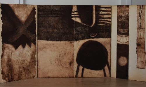
Piet Dirkx cigarbox 676
Piet Dirkx cigarbox 676

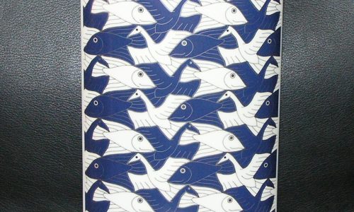
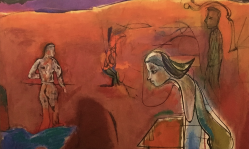
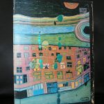
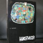
The first time i encountered Hundertwasser his work was in an exhibition at the Stedelijk Museum Amsterdam and the first thought was…..he copies Klimt!
At that time i did not not know much about him, but when you read more and see more of his works you begin to realize that Hundertwasser is as original as Klimt was.
The difference is some 70 years between these 2 artists, but the background, influences and education are all well rooted in the city of Vienna from the beginning of the 20th century. This explains the similarities which one can find in many cases between the works by Klimt and Hundertwasser.

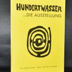
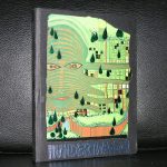
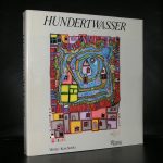
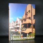
If ever you visit Wien , the Hundertwasser Haus is an absolute must. There are so many aspects about the house and its architecture , that it is impossible to describe it in this blog. However there is a great article on the architecture on the house on the site of the Hundertwasser House;
http://www.hundertwasser-haus.info/en/blog/2011/07/19/the-house-should-not-be-measured-by-normal-standards/
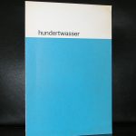
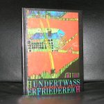
and yes… for the enthousiast collector, ww.ftn-books.com has some nice publications in its inventory including the Wim Crouwel designed Stedelijk Museum one
Box 674 is missing

Piet Dirkx cigarbox 675

Personally i am not the greatest fan of Jeroen Henneman, but i Recognize the importance of the artist for dutch art in the 20th century. Specially the time bracket between 1965 and 1980 is important, because in this period his works found their way into private collections. They were accessible and of high quality, but they never had great appeal to me personally. Nevertheless i encountered his works at auction and exhibitions and i always had an extra look at them, because when you first see them they have something extra, therefore i made the occasional book purchase because i like the institutions were he had his exhibitions. Specially the Nouvelles Images Gallery and the Stedelijk Museum made some great publications with his exhibitions which are both available at www.ftn-books.com
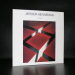
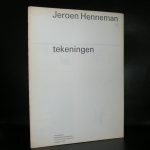
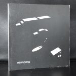
Henneman is certainly one of the best known “modern” artists in the Netherlands and admired by some well known dutch famous collectors, but i am not one of them. Many dutch people know of his portrait of the former Queen Beatrix and his silhouetted portraits are well known too, but as said….i am not a fan.

Piet Dirkx cigarbox 673

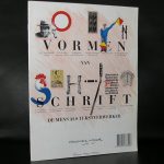
Followers of this blog know of my special interest in the publications of the Stedelijk Museum. I have many titles avaialable and ftn-books.com is one of the first sources that is consulted when it comes to publications of and on the Stedelijk Museum Amsterdam. Yet…. one learns every day, even when you have so many catalogues by the Stedelijk Museum available as i do. It has been years ago that i last saw this catalogue which was published by the Stedelijk in 1984 which gives the best and complete overview of their collecting in the period 1963-1984.
Why is this important? Personally i think that this is the period in which the SM made their best and most important purchases. How about important acquisitions like the ones by Kelly, Dubuffet, LeWitt, de Kooning , Mangold , Lichtenstein and Warhol. Just a few names that belong to the most famous ones, but among the hundreds of these acquisitions there is so much quality art acquired that only with these acquisitions one can fill an entire collection and become with this collection one of the most important Modern Art Museums in the world. The book was compiled by Joosten and designed by Total Design/ Wim Crouwel, which makes it even more worthwhile collecting . It is now available at www.ftn-book.com


Piet Dirkx cigarbox 672
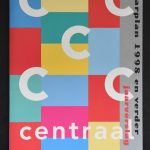
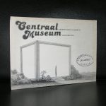
Every decade in Dutch design and typography has its own specialties. In the Interbellum there was the photomontage, Isotype and typography by Zwart, Schuitema and Arntz. After WWII , the Stedelijk MUseum was a source of inspiration for its director Willem Sandberg who made beautiful catalogues for his exhibitions in the Stedelijk. In the late fifties and early sixties Benno Wissing and Wim Crouwel lead the way in design, followed by the Total Design agency who had a leading role in dutch design in the seventies and eighties, which brings us to the Nineties. Here it becomes interesting. The large museums in the Netherlands practically all had their contracts with dutch “house” designers. Walter Nikkels for the van Abbemuseum, Swip Stolk for the Groninger Museum and Gracia Lebbink for the Gemeentemuseum Den Haag were such designers. And then there is the Centraal Museum. They had a very consistent publication program in which design , specially sized/formatted books and bindings were very important. www.ftn-books.com has some excellent examples of these publications for sale . I knew of course of these publications, but when i rearranged some of my inventory, it struck me that these publications are and will become more important in the world of book design every year from now. These publications are still available at reasonable prices , but it will not be long before others will recognize the importance of these books too.

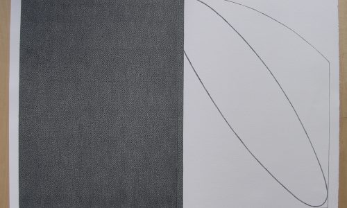
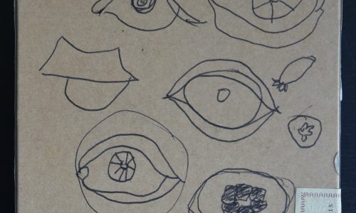
Piet Dirkx cigarbox 671

Readers following the “Piet Dirkx daily” know of my admiration for Piet’s his work.
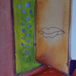
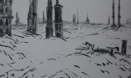
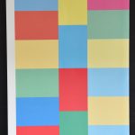
We now have had over 600 cigarboxes and another 300 works to come. Among them cigarboxes, large paintings on wood and works on paper. Within the last category you will find the special of today. Piet made in 2005 some drawings/ gouaches to be sold in the shop of the Gemeentemuseum Den Haag and yes….i bought 3 of them and because i can only hang 2 from those three, i decided to sell the one that is still in one of my drawers.

It is certainly not the least out of those three and because if had first pick from the set which was to be sold i chose what i think were the best. Here it is …..A drawing like a series of open books and buildings, with a typical Piet Dirks mouth drawn in pencil upon them. Colorful, detailed and executed on perfectly square paper . It is the ideal Piet Dirkx composition upon a limited surface. (29,8 x 29,8 cm.)