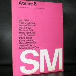
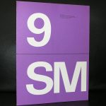
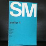
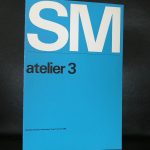
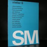
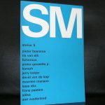
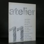
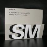
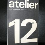
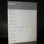
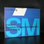
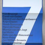
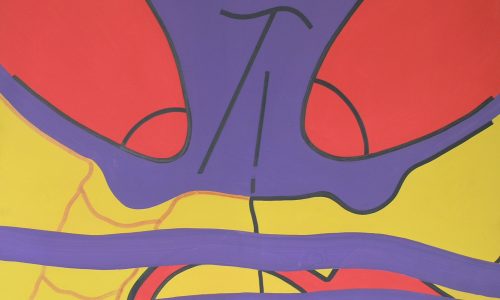
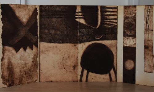
The focus of this blog is on the covers of a very impressive series Wim Crouwel designed for the Stedelijk Museum during a period of roughly 14 years in the Sixties and Seventies ( between 1965 and 1979). This series has the typical Crouwel layout and typography and beside these elements these designs are ” clean” without any frills ….just function. These were done when the Total Design agency had their “GOLDEN YEARS” and Wim Crouwel was one of the most important members of Total Design ( founded in 1963). This is a great series of 16 publications . Some with loose pages in portfolio, others in the shape of posters or just ordinary booklets, but all have the quality design Wim Crouwel stands for. Most of these publications are available at www.ftn-books.com and if your are looking for other Crouwel publications search for them at the same site.
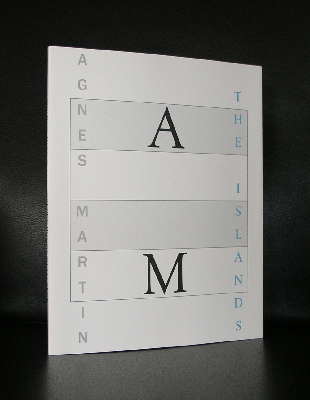
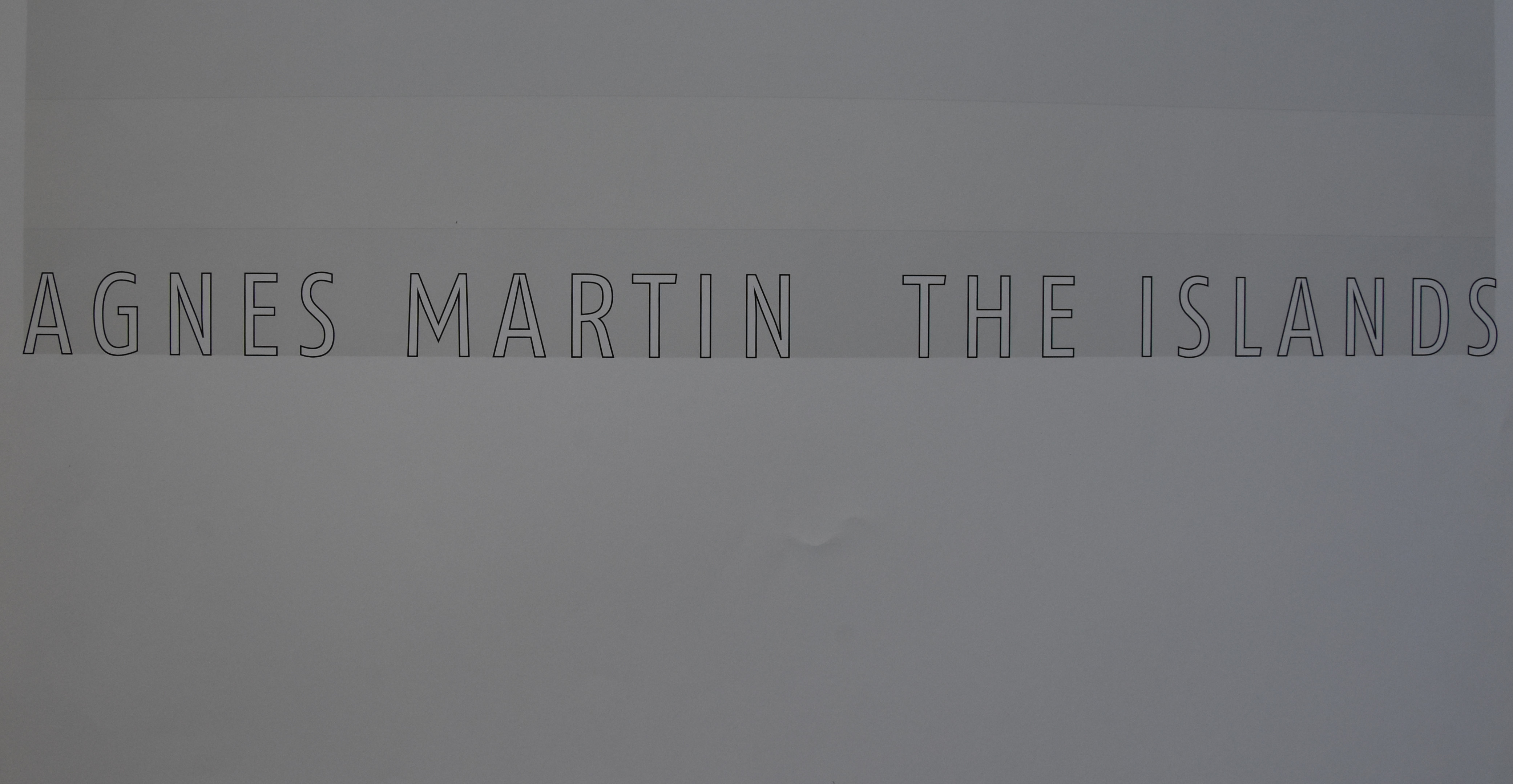
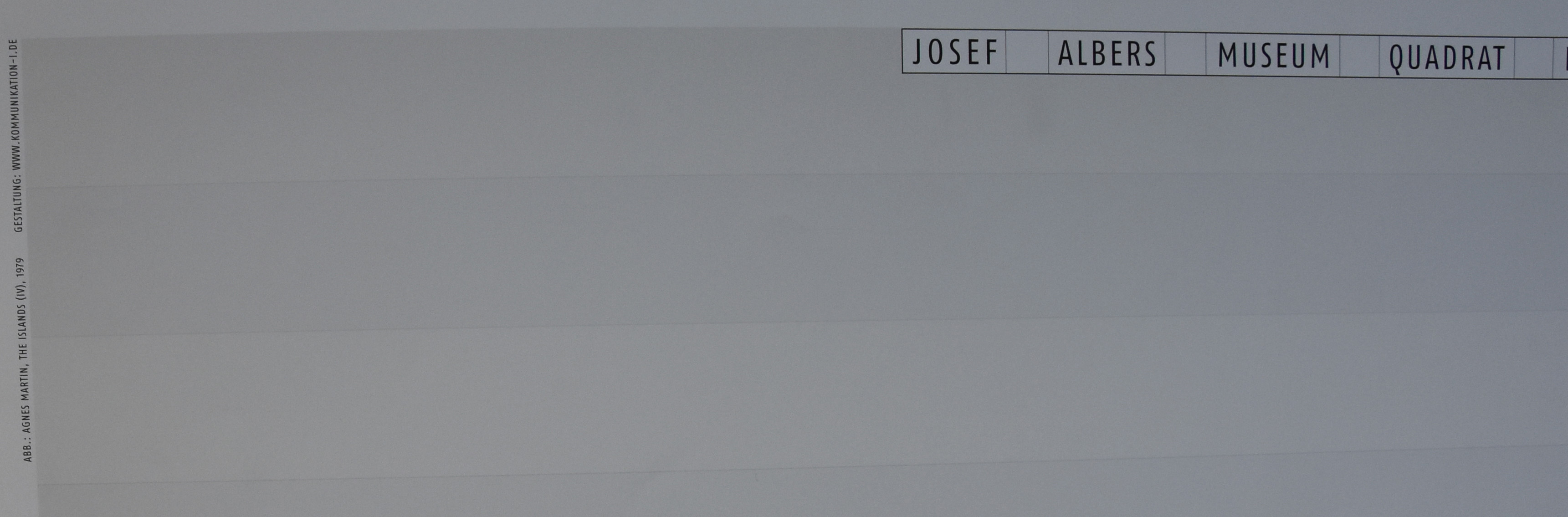
Yesterday i spoke about the Josef Albers Museum in Bottrop and their excellent poster publications. Today i will present the very best of them. It is the magnificent Agnes Martin poster for the “the ISLANDS’ exhibition. Executed as an original silkscreen this poster is a true work of art.
This is a highly collectable and important poster> not only because the exhibition was important, but because of the printing technique this is a masterpiece.
Poster and exhibition catalogue are both available through www.ftn-books.com
Robin Winters has had his exhibitions in the Netherlands. Both in museums and galleries he was presented in solo exhibitions during the 90’s. These days, Winters is represented by the Deweer gallery in Belgium, but in the Nineties there were several who thought this artist was interesting enough to develop special publications with Winters. One of these “specials” was produced by Bebert. It is a large cotton sheet printed with heads which are so typical for Winters his art.
Here is the description as it appears at www.ftn-books.com where this large work is for sale.
Artist/ Author: Robin Winters Title : composition with figures on cotton tissue Published: 1986 Measurements: 150 x 130 cm for the cotton tissue. 16 x 12 cm for the paper print Condition: nm++/ Mint for the large cotton print extra information on this item: Highly collectable multiples by Winters . edition of only 169. Signed and dated with initials on the accompanying paper print.
Later today i will include this beautiful and impressive Robin Winters at www.ftn art too.
Beside this impressive multiple there are some very nice publications published in Europe which are also for sale at www.ftn-books.com
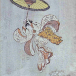
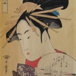
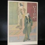
Both are Japanese print masters and there is only a time difference 30 years between these two great Japanese artists, but the difference between them is as large as a classical painting by Sir Alma Tadema and a Modern painting by Soulages.
Where Harunobu’s craftmanship is rooted in the tradition of Japanese print making , i find Utamaro’s prints being far more inventive. His lines are clean and do remind me a little of the outlines used by Herge and Joost Swarte. Classic scenes, actors and geisha’s and even shunga prints, all is mastered by this great Japanse artist. These prints were “In Vogue” by the impressionist artists and that is one of the reasons why so many of them can be found in Western Europe. Monet had them, van Gogh collected them and even made some paintings after them and the Rijksmuseum has thousands of them in their collection from which a selection is now and then on show. These shows are accompanied by some great bilangual catalogues of which the Harunobu and Utamaro ones are for sale at www.ftn.books.com
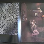
Yesterday, Polish born artist Mark Prent contacted me about the Stedelijk Museum catalogue i have for sale on his exhibition in 1978. A never had studied the catalogue in detail before. But is a “dark’ catalogue which reflects the work of Prent in an excellent way. His works are “dark”
have a look at www.markprent.com and see for yourself what i mean
Mark Prent works consist of life-moulded mixed media, polyester resin and fiberglass casts of human models in sometimes disturbing poses and juxpositions. Mark Prent has consistently maintained throughout the years, that his sculptures and installations do not carry intentional messages. Despite the powerfully grotesque imagery that he has employed, interpretation is left to the viewer. Prent developed his own unique technique of layering to give a heightened realism to his figures; thus giving rise to the label “Extended Realism”. When he later became concerned about the toxicity of polyester resin, he began to experiment with other materials, developing innovative techniques for recreating that trademark quality of virulent realism. This venture into new materials led him in many new directions in his own work and ultimately, to become a technical resource for other artists as well.
Having followed his education in the US and exhibitions in Amsterdam , Berlin and Montreal his works are known all over the world, but because of their “Dark” nature never have become popular.
In 2005 Prent began a new series of video-taped performance pieces in collaboration with videographer/son Jesse Real Prent. In this series, Prent’s own body becomes a living, interacting component of his nightmarish scenarios. He continues to produce new sculptures in his Vermont studio. www.ftn-books.com has the Stedelijk Museum Mark Prent catalogue available.
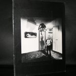
Artist/ Author: Oliver Boberg
Title : Memorial
Publisher: Oliver Boberg
Measurements: Frame measures 51 x 42 cm. original C print is 35 x 25 cm.
Condition: mint
signed by Oliver Boberg in pen and numbered 14/20 from an edition of 20