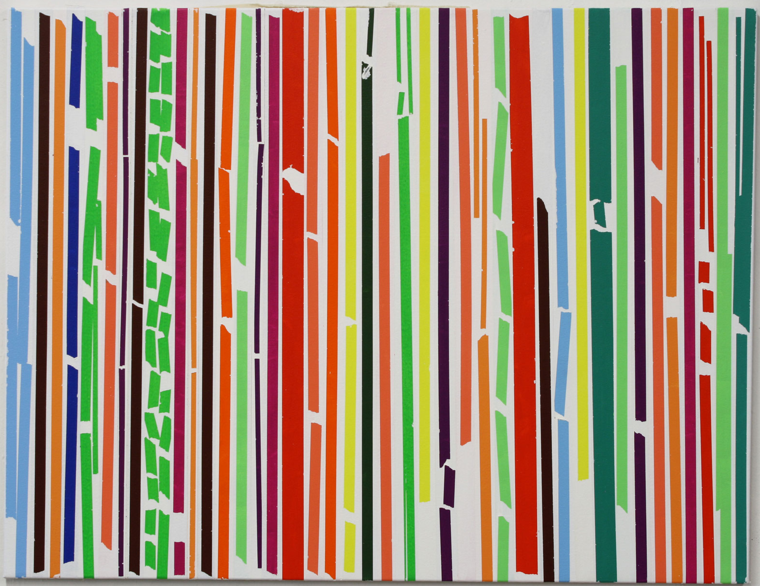
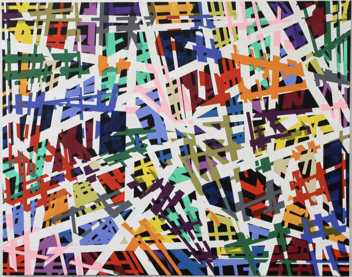
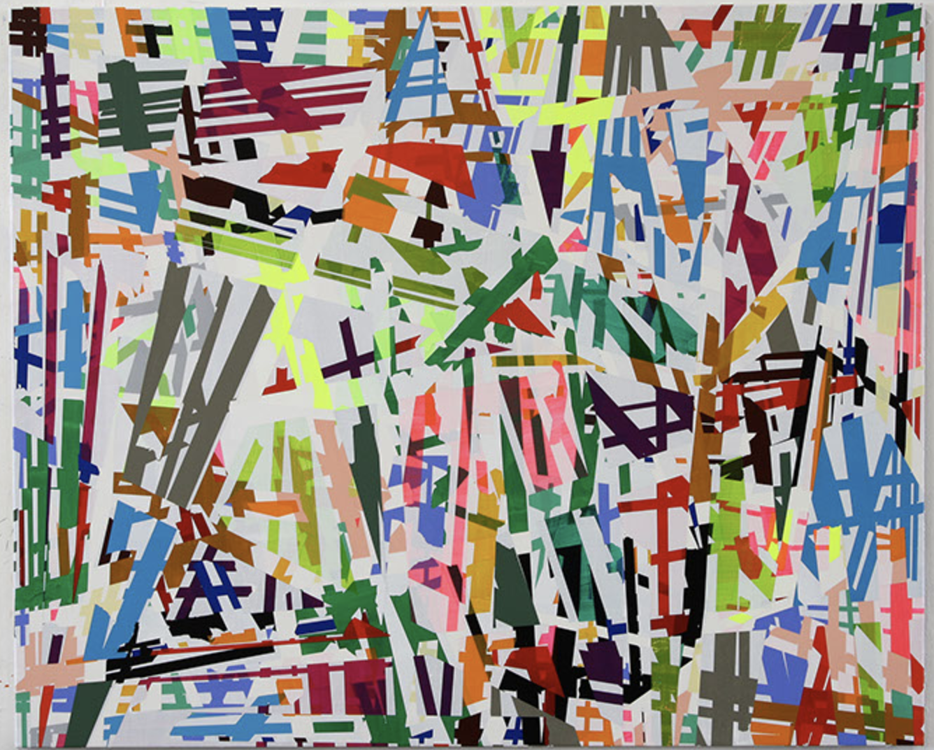
Sometimes you encounter works by an artist for which you have an instant liking and admiration. This is the case with Ruri Matsumoto. She was born in Tokyo and had her education in Japan and Germany. This is where she followed lessons with Helmut Federle and Markus Lupertz a.o.. She stayed after her education in Germany and now has her own studio in Dusseldorf, which she will leave for a temporary studio in Berlin until January 2018.
Her works are characterized by the use of very bright colors and are compositions of almost random like patterns formed with tape, but look more closely….. you will find layers of abstract constructivist forms making a spectacular work of art. Of course art is always something personal and subjective, but i like these paintings very much and because there is this rare chance to see her works at Livingstone Gallery i write this blog to let you know that until the 4th of November some of her works are on show in the PAINTING NOW exhibition, curated by Jan Wattjes.
To get an excellent impression of her works please visit:
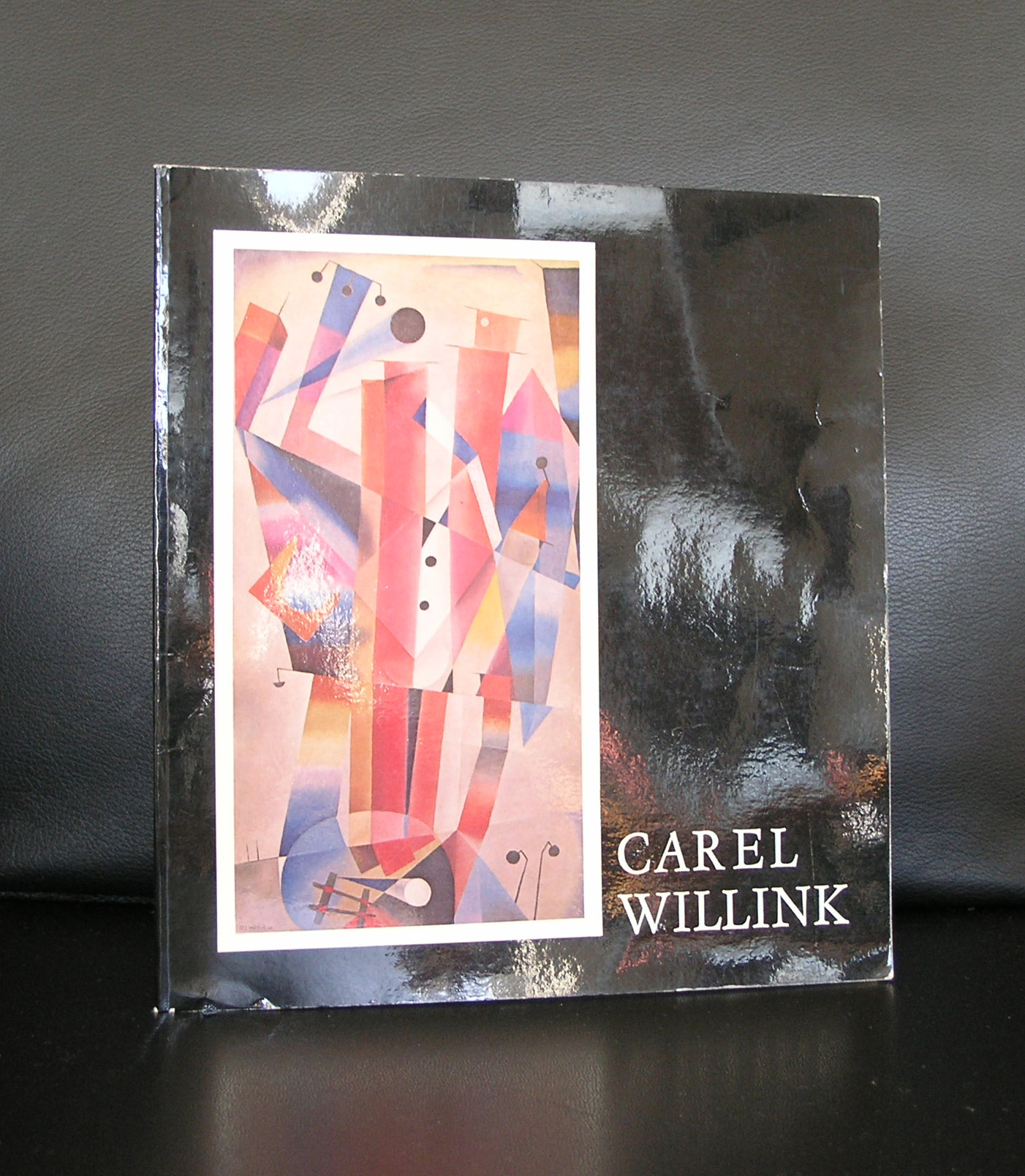
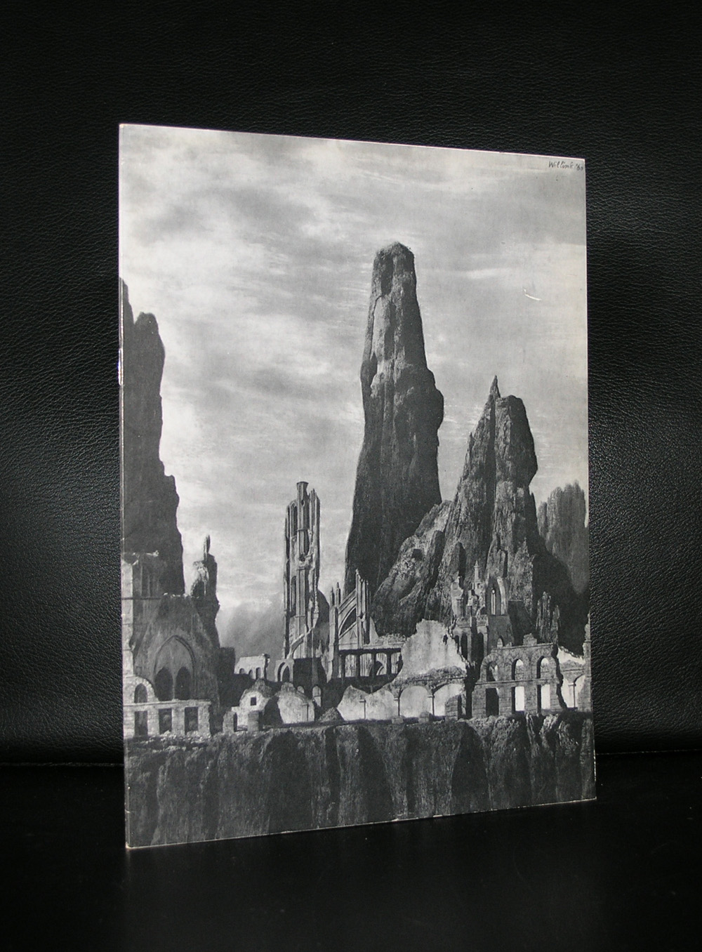
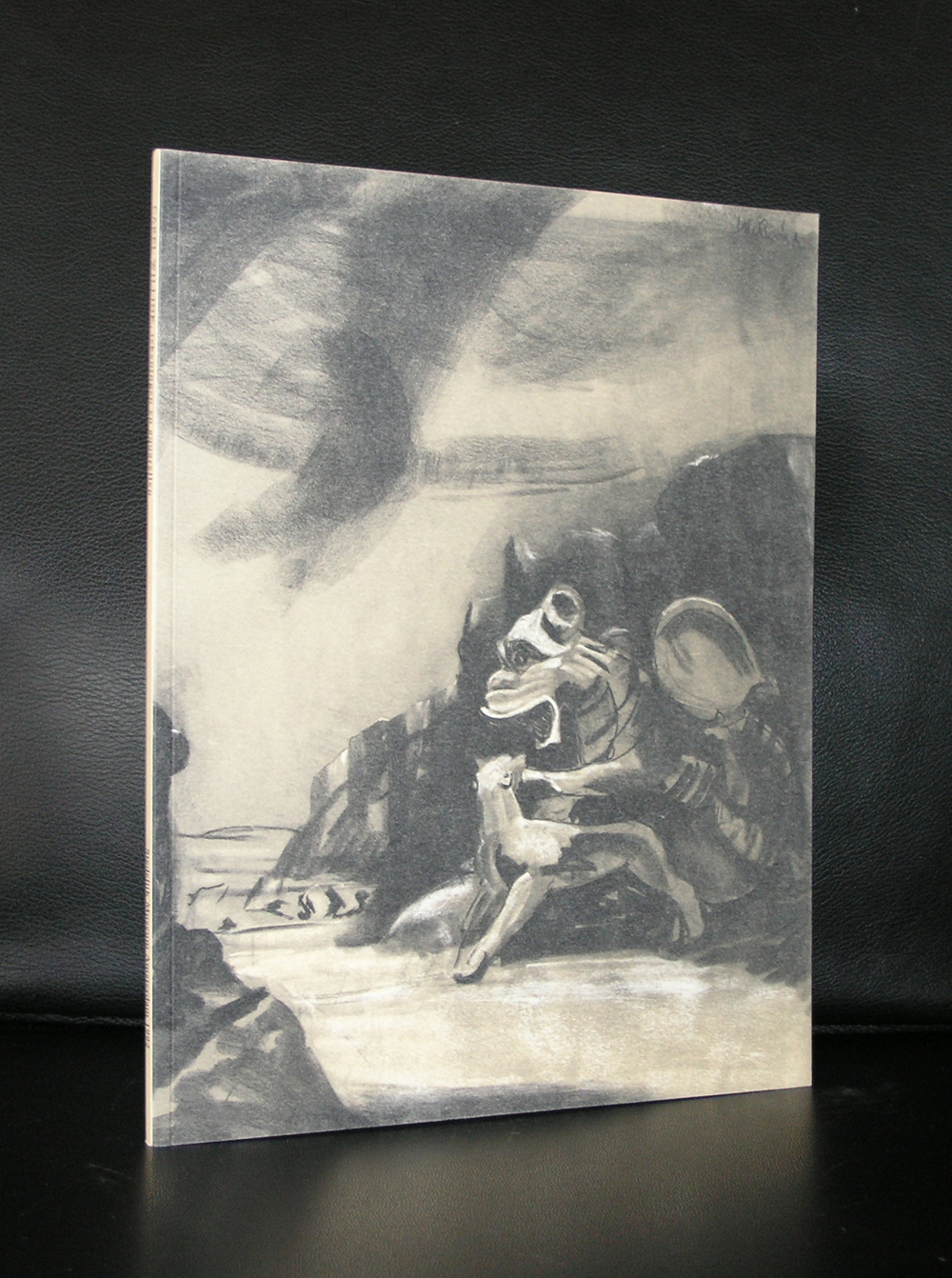
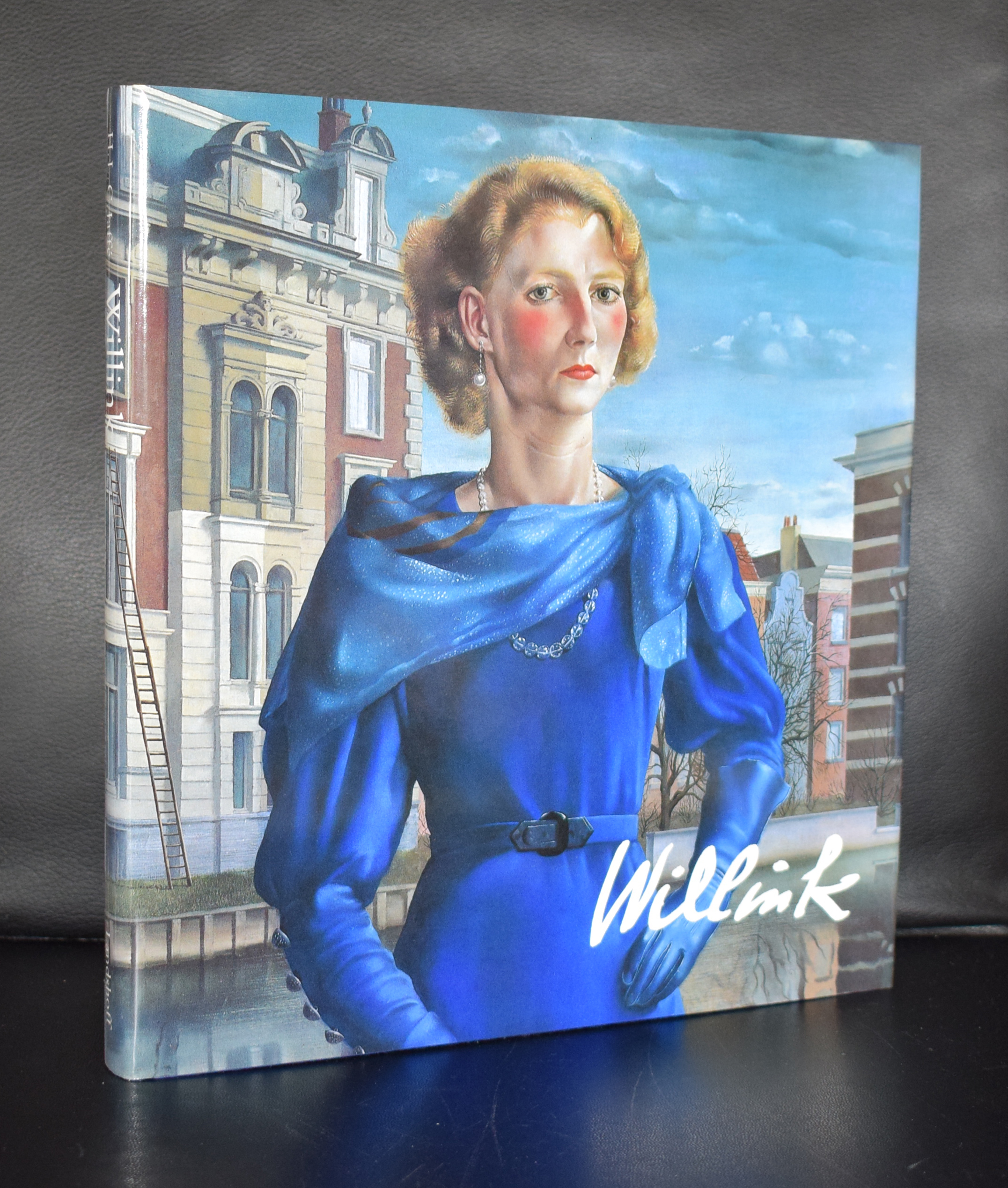
In the time the PC. Hooftstraat in Amsterdam was not a fashion street, but an ordinary city street with a butcher, a grocery, baker, vegetables shop and even a garage. In those days there were some galleries who held residence in the P.C. Hooftstraat,. Among them there was gallery IKON, which presented religious icons and yes, i was the shopkeeper …it was one of my first jobs in the art world. At one day Carel Willink passed by , returned and entered the gallery. Hat, walking stick, bow tie . He really looked like a bohemian. Now almost 35 years later i still remember the person, but as an artist i lost interest. His technique is phenomenal, but in the last years of his life he only took consignments and made portraits for famous dutch people. One exception… . The (nude) portrait he made of his wife Sylvia is exceptionally beautiful.
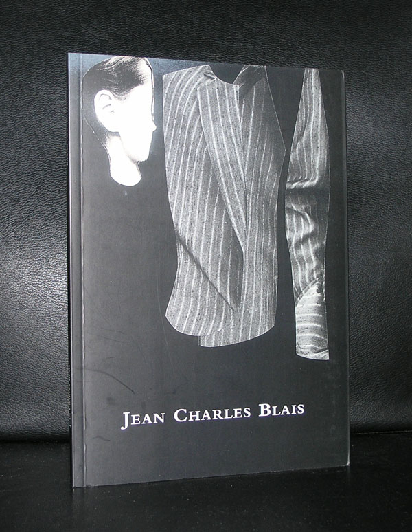
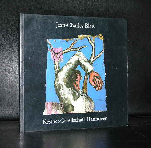
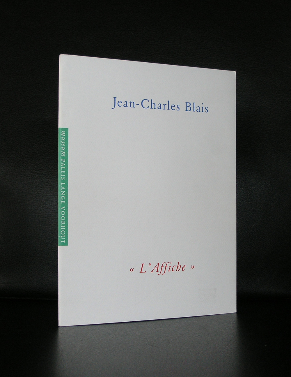
There was a time that the Escher Museum at the Lange Voorhout functioned as a modern art dependance of the Gemeentemuseum Den Haag. Rudi Fuchs initiated this by convincing the municipality of the Hague, that the town was in need of an extra Modern Art museum. A little like the Castello di Rivoli near Torino, where he curated the first exhibitions. Decorated with an original Donald Judd floor, the setting was perfect for modern art. Responsible for the project was John Sillevis who invited some friend artists to exhibit in the palace. One of them Jean-Charles Blais. Together with this exhibition a catalogue was published , which was designed by one of the very best at that time….Gracia Lebbink. Beautiful cahier stiching, printed by Lecturis this is a true gem of a catalogue. Since many exhibitions have been held in the palace but few were as impressive as the Blais exhibition.
Jean-Charles Blais was born in Nantes (Loire-Atlantique) on October 22, 1956. At the tender age of eighteen he enroled at the “École des Beaux-Arts” in Rennes, where he studied for a total of five years. Since the early 1980s Jean-Charles Blais studied the work of the Nouveaux Réalistes, Pop-Art and Arte Povera of Mario Merz, especially the works of the so-called “affiches arrachées”, which had a fundamental influence on Blais’ work. This work, which is determined by the choice of material used to carry the picture, marked his departure to a new kind of painting. On the basis of torn-off advertising posters which are then stuck on top of each other in multiple layers, Jean-Charles Blais developed a pictorial language, that was less interested in the suface of the two-dimensionally formulated message and more concerned with the space articulated “behind” the surface. The multilayered nature of the material and the view to the incidental edges and creases create associative structures. On their basis Jean-Charles Blais created representational motifs, figurative elements, houses and animals, plants and tools on the back. Thanks to numerous solo exhibitions in France and later also in Germany and the USA, Jean-Charles Blais’ works became known to a larger audience during the eighties. His first large-scale work in a public space attracted a great deal of attention in 1990: Jean-Charles Blais was commissioned to design the Paris Metro station “Assemblé Nationale”. In 1996 the “Telephone Booths” project for the “Thinking Print” exhibition of the Museum of Modern Art in New York followed. Digital technologies and new materials have been in the centre of Blais’ creative work since the turn of the millennium.
John Baldessari is a conceptual artist. Personally i am not the greatest fan of his work, but because of his approach to the the work of Sol LeWitt i have this one publication that is very special and of course typical Baldessari and available at www.ftn-books.com
Initially a painter, Baldessari began to incorporate texts and photography into his canvases in the mid-1960s. In 1970 he began working in printmaking, film, video, installation, sculpture and photography. He has created thousands of works that demonstrate—and, in many cases, combine—the narrative potential of images and the associative power of language within the boundaries of the work of art. His art has been featured in more than 200 solo exhibitions in the U.S. and Europe. His work influenced Cindy Sherman, David Salle, Annette Lemieux, and Barbara Kruger among others.
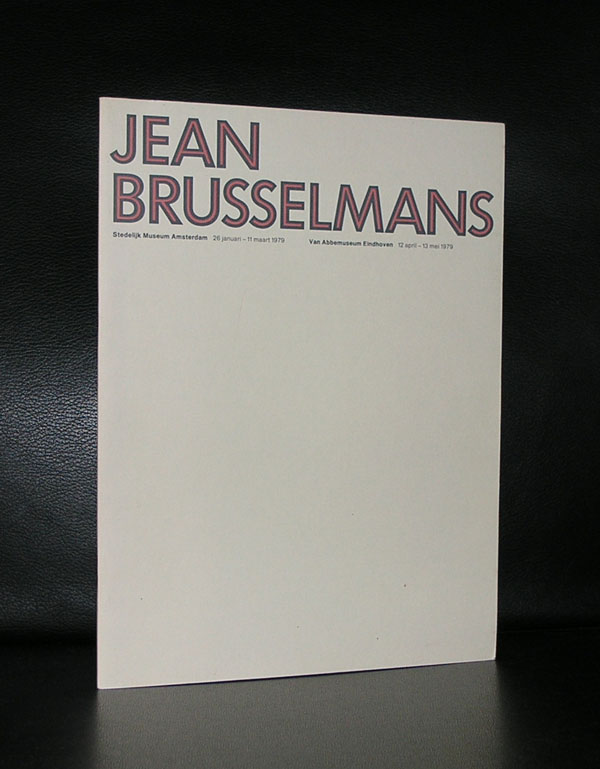
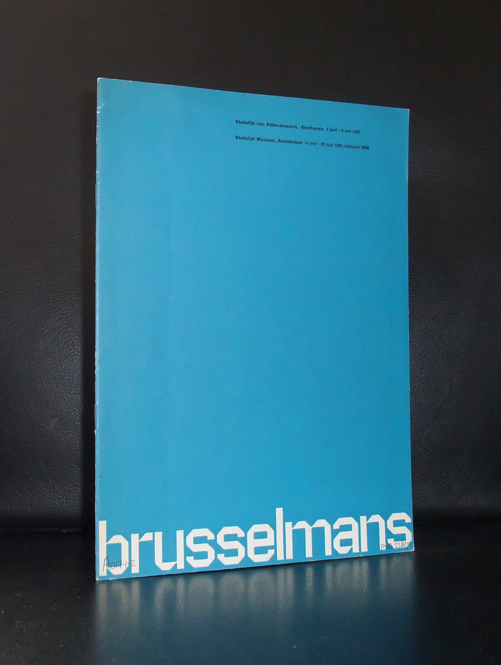
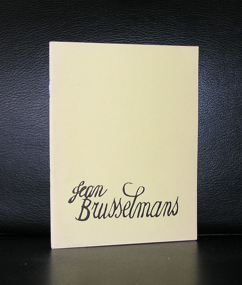
Art Historians have a hard time with Jean Brusselmans. Among them they can not decided wether he is a Fauvist, a Realist or an Impressionist. When you look at his work the first thing that comes in mind is that color and touche are Impressionistic, but look closer and you can distinguish bright Fauve colors which makes the composition a Fauvistic painting.
Perhaps it is best to see that his work is original and that you can recognize it as Jean Brusselmans. Forget the art historians and their division into Art Mouvements. Just look at his work and see that it is Jean Brusselmans.
3 catalogues are available on Brusselmans at www.ftn-books.com of which two are designed by Wim Crouwel
This is a special blog on Minimal art . This time i am offering my readers a real treat.
As you might know the Gemeentemuseum published in the late nineties a cd rom containing the PDF files of possibly the 3 most important and sought after Minimal Art exhibition catalogues which were held in Europe in the late sixties. A European first…..All three were curated by Enno Develing and all three were accompanied by a simple but important catalogue. All these catalogues ( LeWitt, Minimal Art, Carl Andre) sold out completely and because of the demand and art historical importance we decided to buy some antiquarian 2nd hand copies, strip them from their backbones and scan them as PDF files for future use and disclosure to students and publish them in a very limited number on cd rom.
At that time i bought the CD rom. The CD rom player on my Mac disappeared, but i kept the files on my hard drive including the Carl Andre, LeWitt and Minimal Art catalogues in pdf format . You can view the Minimal Art catalogue here: MINIMAL ART
For the complete CD ROM or separate files of the other catalogue please visit www.ftn-books.com
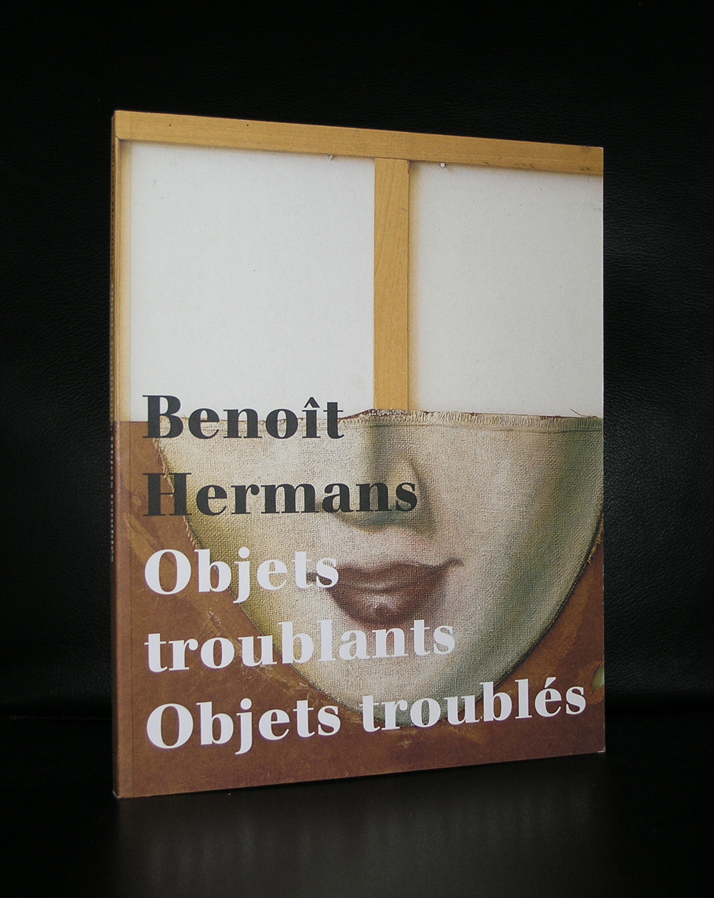
Starting this blog with the internet address of Benoit Hermans for those among you who do not know his work. Hermans exhibited on multiple occassions in the Bonnefanten museum , but it took some years and Rudi Fuchs to present his art in Amsterdam. It was in the late nineties that he first received an exhibition in Amsterdam at gallery van Dieten and participated in the Stedelijk exhibitions ON THIN ICE and UP TO NOW. Benoit’s his art is fascinating. He combines every day persons /objects into collages making them feel strange and surreal.
Een kopietje van Lichtenstein’s schilderij ¨I’VE HOOKED A BIG ONE¨ circuleerde al enige tijd in mijn atelier. Het fascineerde me vanwege de manier waarop Lichtenstein erin geslaagd was het typische Disney-idioom om te zetten in een goed lopend schilderij. Want in tegenstelling daarmee verzetten Disney’s tekeningen zich letterlijk nergens tegen de regels van het alledaagse zien. Ze sluiten zo direct mogelijk aan bij het meest voor de hand liggende, gaan altijd moeiteloos op in die allesverzengende brij van altijd geldende kijkgewoontes. Zo komt er in zijn tekeningen nooit een vorm voor die raadselachtig blijft. Altijd gaat het ene lusvormige onderdeel vloeiend over in het andere. De hele wereld is gereduceerd tot soepel in elkaar grijpende verzameling van krullen en cirkels – of het daarbij nu gaat om de snavel van Donald Duck, de kraag van zijn zeemansjasje of zijn veel te dikke eendenpoten. Zelfs de tekstballon wordt op die manier helemaal een met degene die hem uitspreekt. Dat maakt het nogal moeilijk om daar een goed schilderij van te maken. Ik vond het deste frappanter dat het Lichtenstein toch was gelukt.
Op een gegeven moment kwam dat fragment in de buurt van een reproductie van Caravaggio’s “Ongelovige Thomas” terecht en meteen viel me op hoe goed Donalds verwondering over zijn visvangst (dat is eigenlijk de vangst van zichzelf, want het haakje is in zijn eigen staart terecht gekomen) plotseling leek samen te vallen met de ontzetting waarmee Thomas Christus’ wond inspecteert. In de eerste plaats door het formaat van Donalds ogen, die daarom alleen al niet zozeer naar de wond als wel dwars door Jezus heen lijken te kijken. Het lijkt wel of ze zijn lichaam nog ’s extra doorboren met hun blik. Maar zeker ook doordat het krullende van Disney’s stijl de welving van de wond als het ware versterkt.
Bovendien realiseerde ik me tegelijkertijd hoe een drietal vormen van iconoclasme – twee oudere en een meer recente – op deze manier in één enkel beeld samenvielen. Die twee eerste vormen zaten al min of meer besloten in het schilderij van Caravaggio zelf. Die laatste werd door Donald Ducks aanwezigheid daaraan toegevoegd.
Wat ik bedoel is het volgende. Caravaggio’s versie van ´De ongelovige Thomas´ is op zichzelf een iconodulisch manifest in het kwadraat. Het drijft volgens mij namelijk hét centrale argument, dat de verdedigers van het beeld tegen zijn tegenstanders inbrachten, volledig op de spits. De tegenstanders van het beeld wezen er namelijk in eerste instantie op, dat het goddelijke als zodanig niet is af te beelden en dat dus elke poging het wel te doen uitloopt op blasfemie. Elke poging God in een beeld te vangen zou een daad van heiligschennis zijn.
Ter verdediging van het beeld wezen de iconodulen er vervolgens op dat het toch ook God zelf was, die besloten had zijn eigen zoon deel te laten nemen aan deze ‘goddeloze’ werkelijkheid van het ondermaanse. Waarom zou dan een andere verschijningsvorm, of liever: een andere vorm van incarnatie, daar dan geen getuigenis van mogen afleggen? De iconodulen wezen met andere woorden op de in hun ogen essentiële overeenkomst tussen de dubbele natuur van Christus en die van het beeld. Beiden namen gelijktijdig deel aan zowel de goddelijke als de wereldse dingen.
Nu speelde zich deze strijd tussen voor- en tegenstanders van het beeld af in de achtste en negende eeuw na Chr., dat wil zeggen meer dan achthonderd jaar, voordat Caravaggio zijn versie van de ongelovige Thomas schilderde. In de tussenliggende eeuwen was de houding van de kerk ten aanzien van het beeld totaal veranderd. Inmiddels was de schilderkunst al uitgegroeid tot een volkomen geaccepteerd propagandamiddel van de kerk en om die reden een belangrijk wapen geworden in de strijd tegen een geheel nieuw soort iconoclasme, dat van de protestanten.
Dat Caravaggio voor de kerk werkte ten tijde van de contra-reformatie, komt in zijn werk heel duidelijk tot uitdrukking. In de eerste plaats is daar de monumentaliteit en eenvoud van zijn composities. Hiermee kwam hij de voorstanders van de reformatie in zekere zin tegemoet. Want de eenvoud was uitdrukking van zijn verlangen terug te willen gaan naar de bron, dat wil zeggen te komen tot een zo direct mogelijk contact met datgene waar het in de bijbel om ging. Caravaggio deed er alles aan de toeschouwer ervan te doordringen, dat hij als het ware direct getuige was van datgene wat zich meer dan 1600 jaar geleden ooit had afgespeeld en dat hij zich daarop moest concentreren en niet op ingewikkelde, theologische toevoegingen van later datum. Ook een aantal andere, hele karakteristieke kenmerken van zijn werk zijn hierop terug te voeren. Zo gebruikte hij vaak als model hele volkse types, die in niets leken op de idealiserende kunst van de voorafgaande generaties. Een overdreven realistische weergave van handen of gezichten wijzen in die richting, maar vooral dus een uitgekiend gebruik van het door hem uitgevonden clair-obscur.
Gezien de achtergrond van het iconodulisch argument zou je kunnen zeggen dat Caravaggio op deze manier in zijn strijd tegen het tweede soort iconoclasme het inhoudelijke argument van het eerste radicaal versterkt. Want naarmate hij erin slaagde Jezus en zijn wond realistischer te schilderen, versterkt hij impliciet het iconodulische argument, dat uitgaat van de radicale overeenkomst tussen de goddelijke vlezigheid van Jezus én het materiële van het beeld.
In mijn eigen versie komt er dan nog een derde iconoclastisch gezichtspunt bij, dat te maken heeft met de reden waarom Lichtenstein in de jaren ’60 de hengelende Donald schilderde. Dat hing namelijk samen met een zoveelste beeldverbod, deze keer uitgevaardigd door een lid van de kunstgemeenschap zelf, namelijk de Amerikaanse kunstcriticus Clement Greenberg.
Voor de zoveelste keer is de houding ten aanzien van het beeld weer veranderd. Inmiddels heeft de zichzelf serieus nemende kunst de beschermende en beeldbepalende ruimte van de kerk al meer dan twee, drie eeuwen verlaten en is in staat gebleken geheel aan haarzelf gewijde ruimtes in het leven te roepen. En Greenberg wil nu dat de schilderkunst ook nog de laatste stap zet op weg naar de absolute autonomie; met het opgeven van de christelijke iconografie als leidraad heeft deze kunst volgens hem inmiddels ook de afbeeldende functie als zodanig verloren. Dus eist Greenberg de afschaffing van de figuratie als zodanig. Volgens hem heeft deze een optimale ontwikkeling van de kunst sinds eeuwen in de weg gestaan en kan de kunst alleen maar haar ware bestemming bereiken, als kunstenaars zich nog uitsluitend bezighouden met een onderzoek van het schilderij als plat vlak. En Lichtenstein’s schilderij van Donald Duck was op dat moment een bewuste stellingname tegen dit Greenbergiaanse (niet beeld- maar) afbeeldverbod. Lichtenstein heeft Donald Duck hier eigenlijk gebruikt om de schilderkunst te refigureren.
Tegen de achtergrond van deze derde laatste vorm van iconoclasme zou je nu kunnen zeggen dat de ongelovige Donald in dit schilderij namens Thomas en de ongelovige Clement een dubbel onderzoek verricht. Ten eerste naar de echtheid van Christus’wond en ten tweede naar de echtheid van het geschilderde. En in de visie van Greenberg betekent dat eigenlijk dan weer ten faveure van de afschaffing van de figuratie. En zo te zien vindt ie dat maar wat leuk. Want een en ander gaat gepaard met een enorme vondst: ´I’ve hooked a big one´. En die BIG ONE temidden van al dat iconoclastisch geweld, dat is hij natuurlijk zelf.
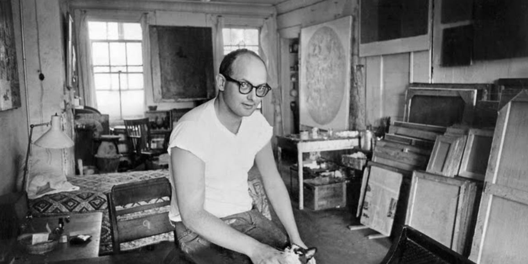
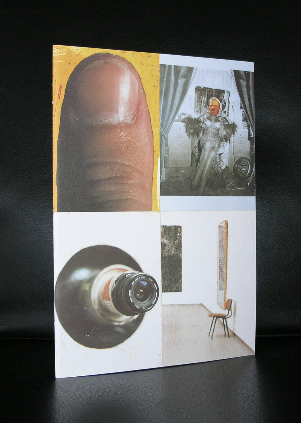
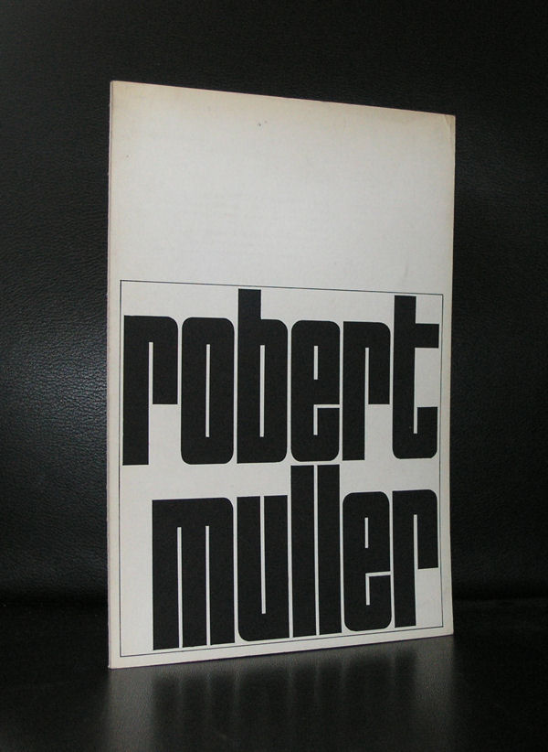
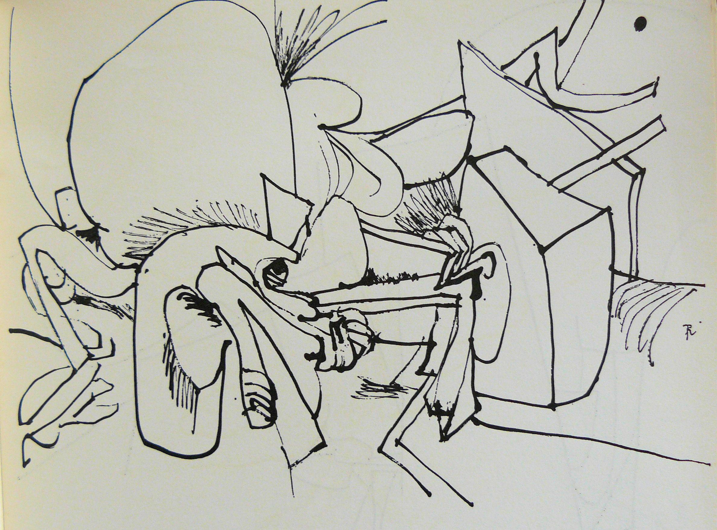
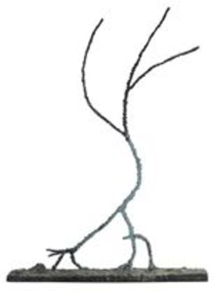
Because of the Robert Mueller that is in the new at these days ai was reminded of the Robert Muller who made some wonderful drawings and sculptures in the sixies and presented those in an exhibition in the Stedelijk Museum in 1968 ( Crouwel designed catalogue).
Try to find some information on Robert Muller at these days and it is almost impossible to find anything except for the books i placed on the internet for sale at www.ftn-books.com. Perhaps Muller is almost forgotten or the other FBI ROBERT MUELLER pushes all information away, but not deservedly. This Robert Muller i admire has made some of the nicest most impressive little sculptures i know of in the sixties and is a typical sixties artist and deserves a place among the best sixties artists.
“Sometimes, though not always, old meanings invade the new forms and hold on with a tenacity that cannot be broken. At other times the forms are innocently open to any of the uses we might make of them.”
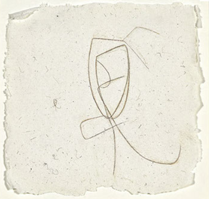
Joel Fisher is the master of making little works of art that mock with the abstract figuration. He was not that frequently invited to have an exhibition in the Netherlands , but i know of 2 occasions that there was one. The first in 1978 in the Stedelijk Museum Amsterdam, which catalogue is available at www.ftn-books.com
and secondly a far more obscure exhibition in gallery Art Affairs in 1993. Both were rare occasions to see his works, but what i remember most is the pure simplicity of his drawings.
With a few lines he shows that he is almost perfect in his composition, which is a true quality. I like it very much when with so little effort such a nice result is created. These are not random lines, but carefully created compositions. It is the quality i like so much in an artist. and for me Fisher operates with his art in the same category as Miro and Ouborg.
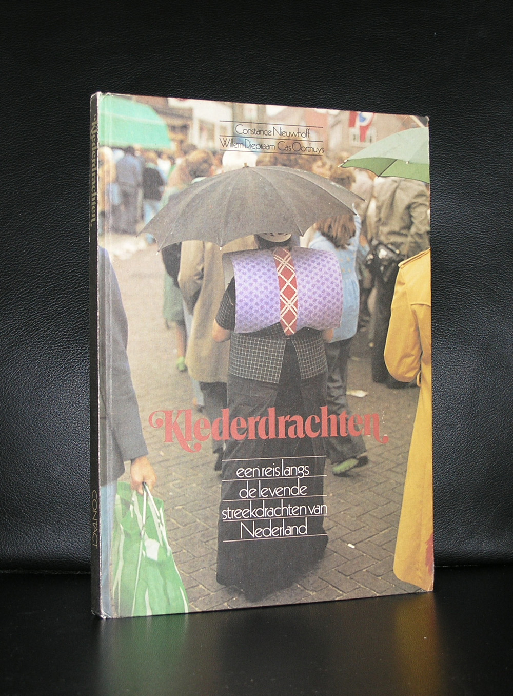
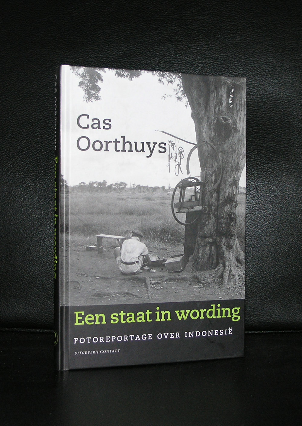
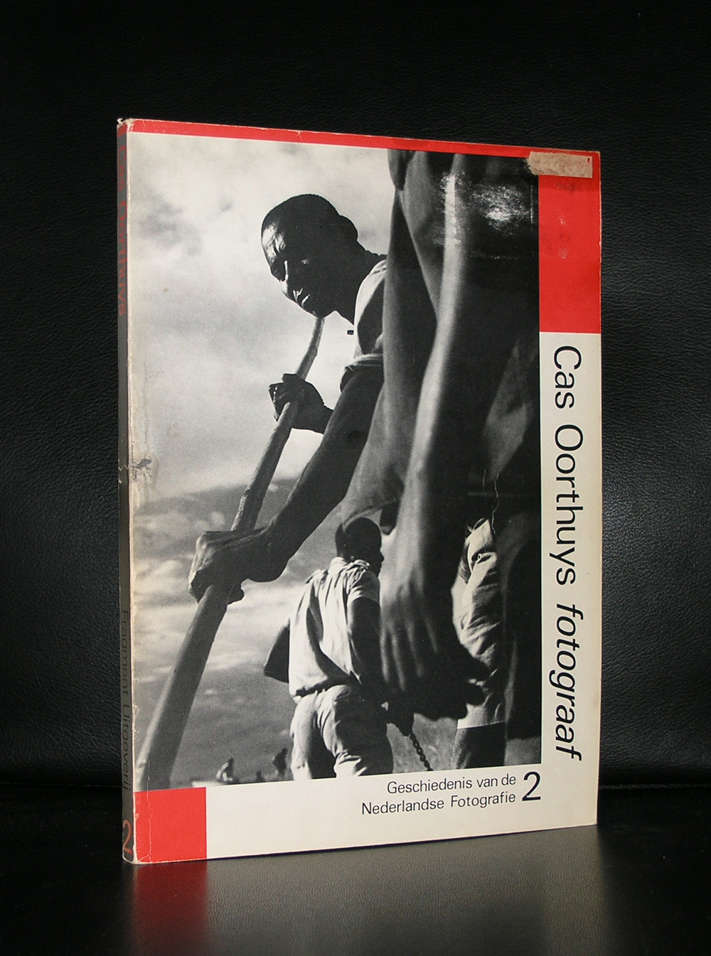
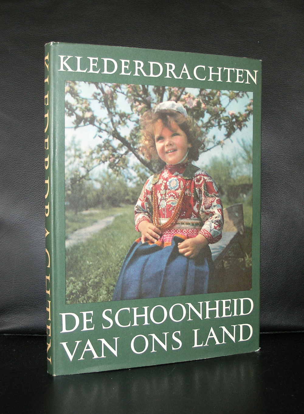
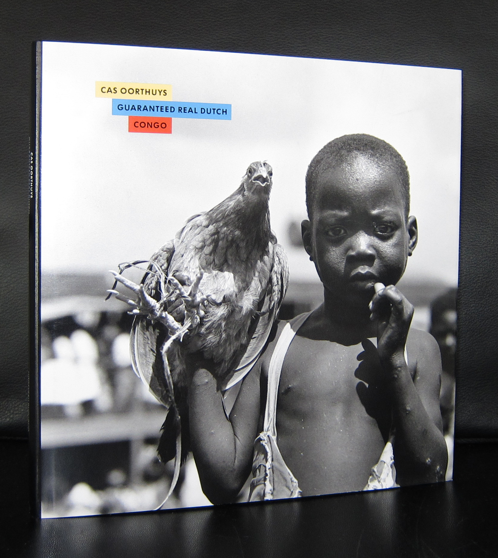
If you like dutch photography from the 20th century and specially the photography by Cas Oorthuys, you must take a look a the series of books DE SCHOONHEID VAN ONS LAND , which were published along a general theme, depicting the typical dutch countryside, landscapes, cities , costumes and people of the fifties . The series was published by Contact over a decade. An excellent series with many photographs by Cas Oorthuys who started his career right after WWII and was contracted for this Contact series in the Fifties. Later he would publish many books of which some are available at www.ftn-books.com. His archives with over 500.000 negatives is believed to be one of the largest of any photographer. Oorthuys is a true master of dutch photography.
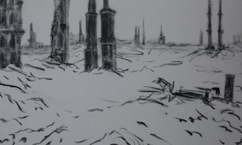
Artist/ Author: Oliver Boberg
Title : Memorial
Publisher: Oliver Boberg
Measurements: Frame measures 51 x 42 cm. original C print is 35 x 25 cm.
Condition: mint
signed by Oliver Boberg in pen and numbered 14/20 from an edition of 20