Posted on Leave a comment

Edvard Munch (1863-1944)…kisses compared

Schermafbeelding 2017-08-17 om 16.16.22

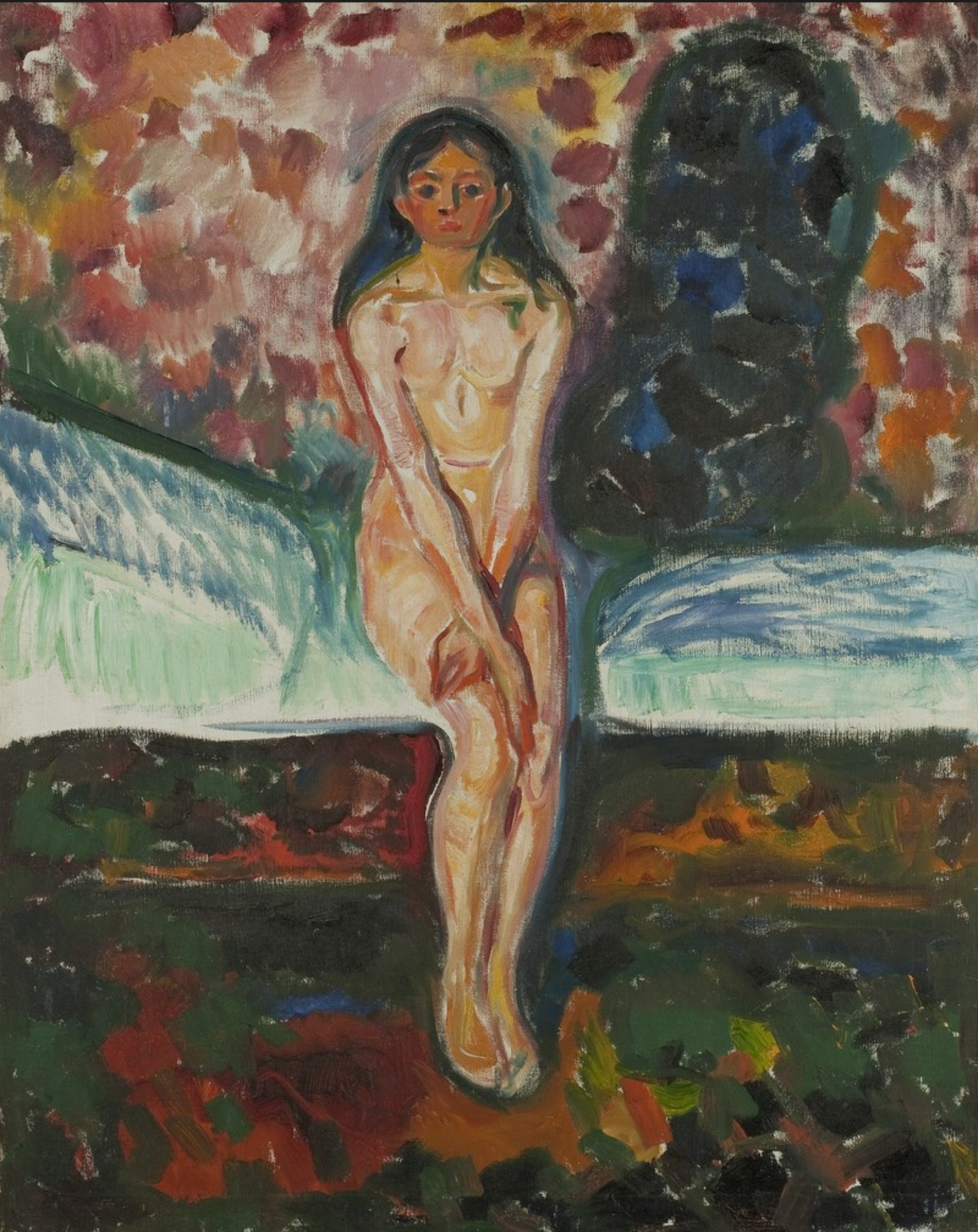
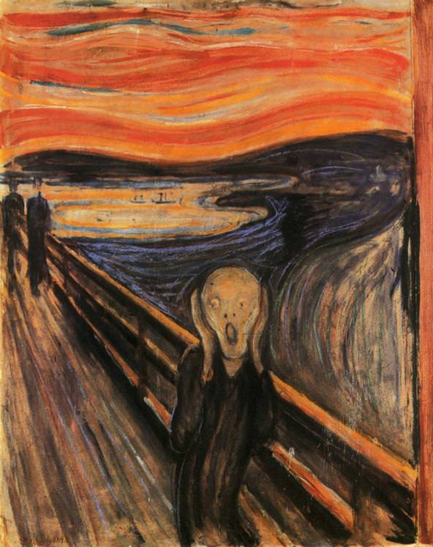
I do not know exactly what it is that draws me into the paintings by Munch. I tried to analyze their attraction for me. It is not the technique, nor the great way they are painted, but what i like about them is the use of color and the drama they radiate. Take for instance the famous Scream or Puberty. Both ooze atmosphere and “action” in a surreal colored setting.

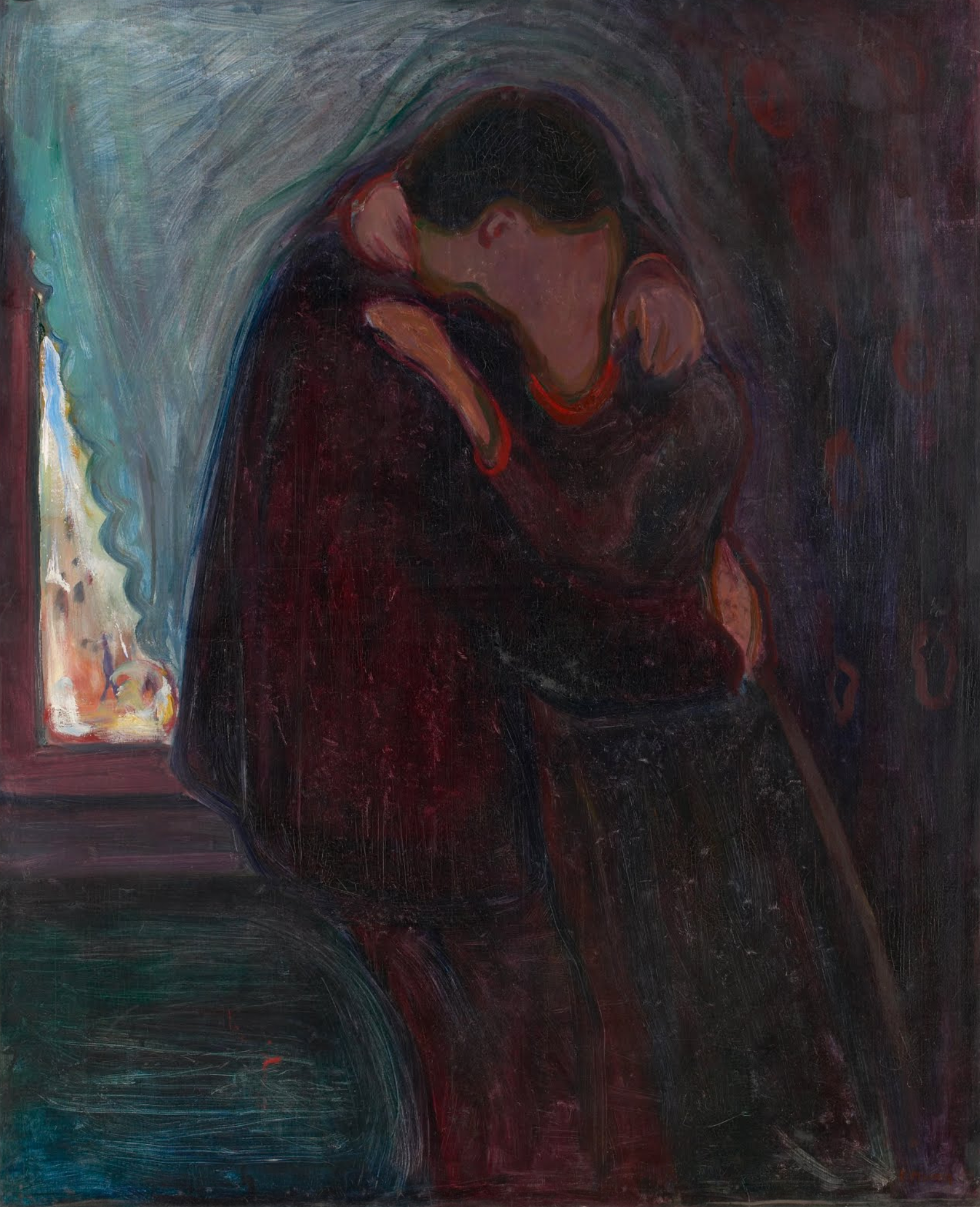
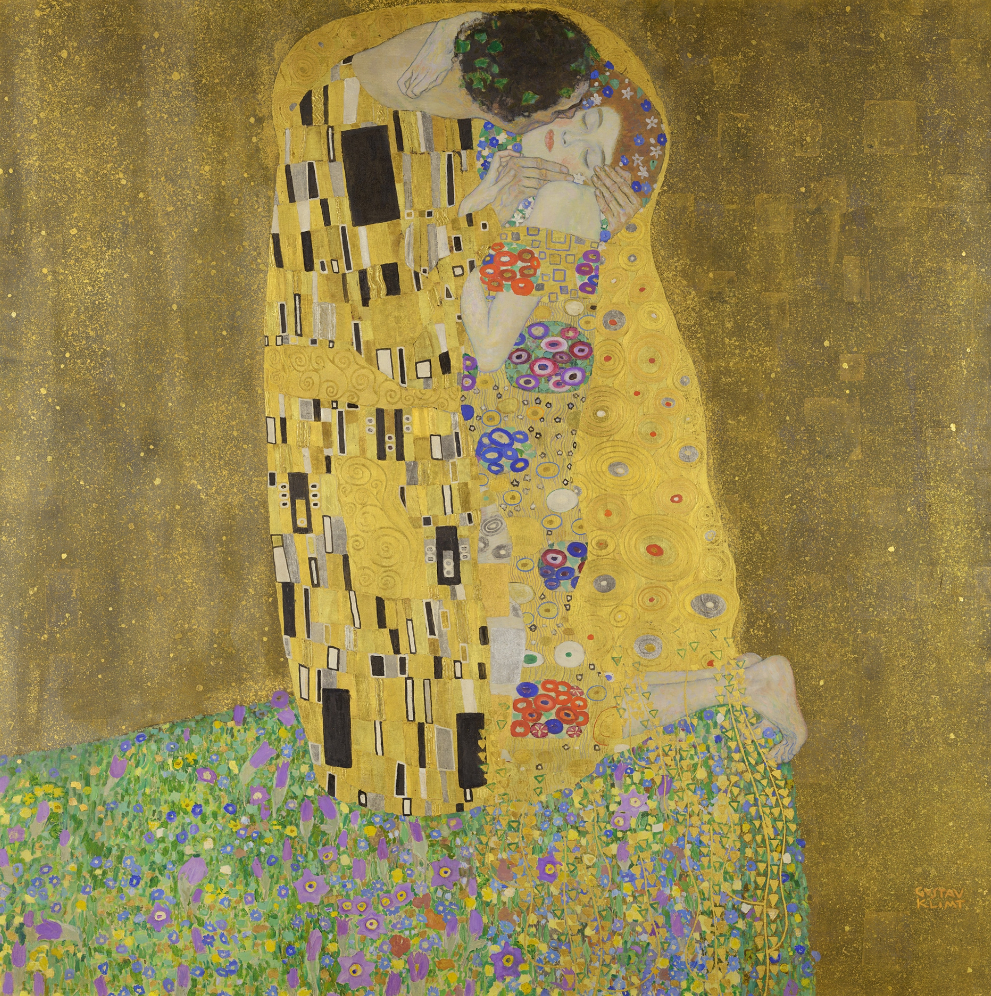
Or compare the kiss by Much with the kiss by Klimt. The Munch kiss is a sensuous one, whereas the Klimt kiss is styled . Both done in the same decade, but for me the kiss by Munch is more authentic. Certainly the Klimt Kiss is more appealing, because the time we visited the Belvedere and saw it in reality in its special room with perfect lightning it was amazing, but the Munch kiss is a real kiss and must be admired just for that reason.

Munch is still not the household name as he should be, but that is a matter of time. Just a few decades and he will be known all over the world. Not only for a few iconic paintings , but for his complete oeuvre. Munch publications are available at www.ftn-books.com

Posted on 22 Comments

Constant (1920-2005)

Schermafbeelding 2017-08-17 om 14.02.00.png

Another Cobra artist that i have met personally ( but only for a very brief conversation about his catalogues) was Constant ( Nieuwenhuijs ). From the 3 Cobra artist that i have met personally i liked him the best, because besides his Cobra period , he developed himself into a multi talented artist. His New Babylon constructions have proven to be a vision on the future and become more and more important in art history. Even his watercolors that he made at the end of his career are to be admired. Great technique and composition make these belonging to his best works from his career. Constant has always kept a special relation with the Gemeentemuseum Den Haag and because of this special relation with the museum and his former director ( Hans Locher) the museum has the most important collection from all periods out of his career. Cobra, New Babylon , paintings and drawings all are present and will prove to be important in the coming centuries.

http://www.arttube.nl/videos/constant-new-babylon

Constant will probably be one of the most important dutch artists to remember and admire for his complete oeuvre.www.ftn-books.com has some nice classic and collectable publications on Constant ( Nieuwenhuijs).

and yes….www.ftn-books.com is one of the few booksellers who can offer you the famous Constant New Babylon book by Wigley

OLYMPUS DIGITAL CAMERA

Posted on Leave a comment

Eric Fischl (1948) Provocative Neo-Impressionism

Schermafbeelding 2017-08-17 om 12.14.17

Provocative? Maybe for the US , but for us Europeans this is far less provocative and controversial than for US citizens.  The first time i encountered work by Fischl was when i read about him in one of The Parkett magazines in the eighties. I could see the provocation within the scenes of the paintings and because of the subjects one makes up complete stories on the scenes depicted within these paintings. These scenes trigger your imagination and because of that imagination these are powerful paintings.

Realism in a very personal and highly recognizable style,  a symbiosis of Hopper and Rockwell, resulting in a Fischl painting. For me Fischl is the artistic contemporary son of Edward Hopper and Norman Rockwell, who depicts in a provocative way every day life of the Americans. www.ftn-books.com has one title on Fischl available at the moment

Posted on Leave a comment

Willem Sandberg (1897-1984) typography

It is almost a year since I tipped the readers of my blog to start to collect Willem Sandberg typography. Since, i have found some interesting examples of his excellent typography which i want to present to you. For those of you who are new in reading this blog. Willem Sandberg was a designer /typographer who became director of the Stedelijk Museum Amsterdam for a very long period ( 1945-1963) who designed many of the publications during this period of time and who contacted and presented many of the most famous 20th century artists in the Stedelijk Museum. His publications are characterized by the use of plain ( carton like papers) and the lettering looks random, made out of torn papers. But these are very accurate designs. You can find many sources of information on Sandberg on the internet, but one of the best is still the site of the Stedelijk Museum Amsterdam. ( www.stedelijk.nl ). Now here are some new and old additions to the inventory of www.ftn-books.com


Posted on Leave a comment

Among Photographers…. Fieret, Nollen, Dijkstra, Breukel ao, isbn 9789086900817

among a

Ask me …what is the best publication on dutch photographers from the last generations. The answer must be AMONG PHOTOGRAPHERS . Published by Veenman in 2007, this book contains the very very best in dutch photography. The cover is striking with the portrait of Fieret by Koos Breukel. Almost a surreal approach to a portrait but so recognizable as being a Breukel portrait of the famous Gerard Petrus Fieret. This is a rare occasion that i can offer this book at www.ftn-books.com . This and other tiltes  on the dutch photography are available at www.ftn-books.com