Posted on Leave a comment

Bruce Nauman (1941) and the CAROUSEL (1988)

Schermafbeelding 2017-07-18 om 14.06.28

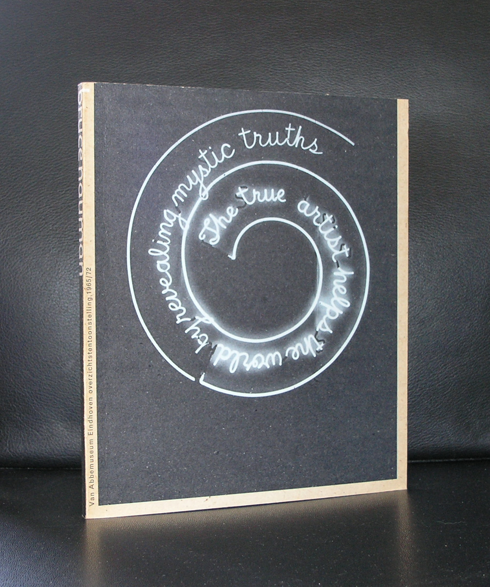
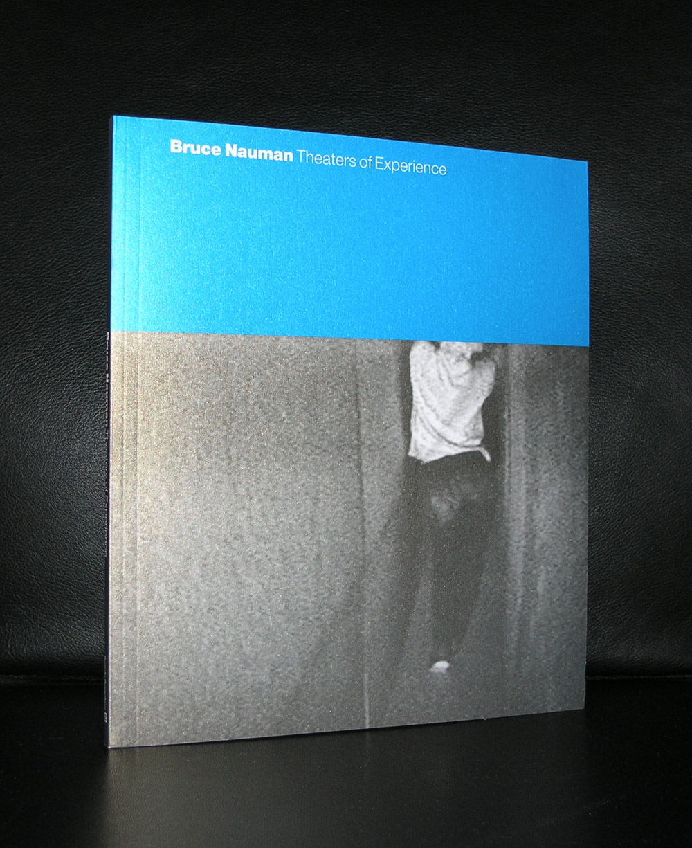
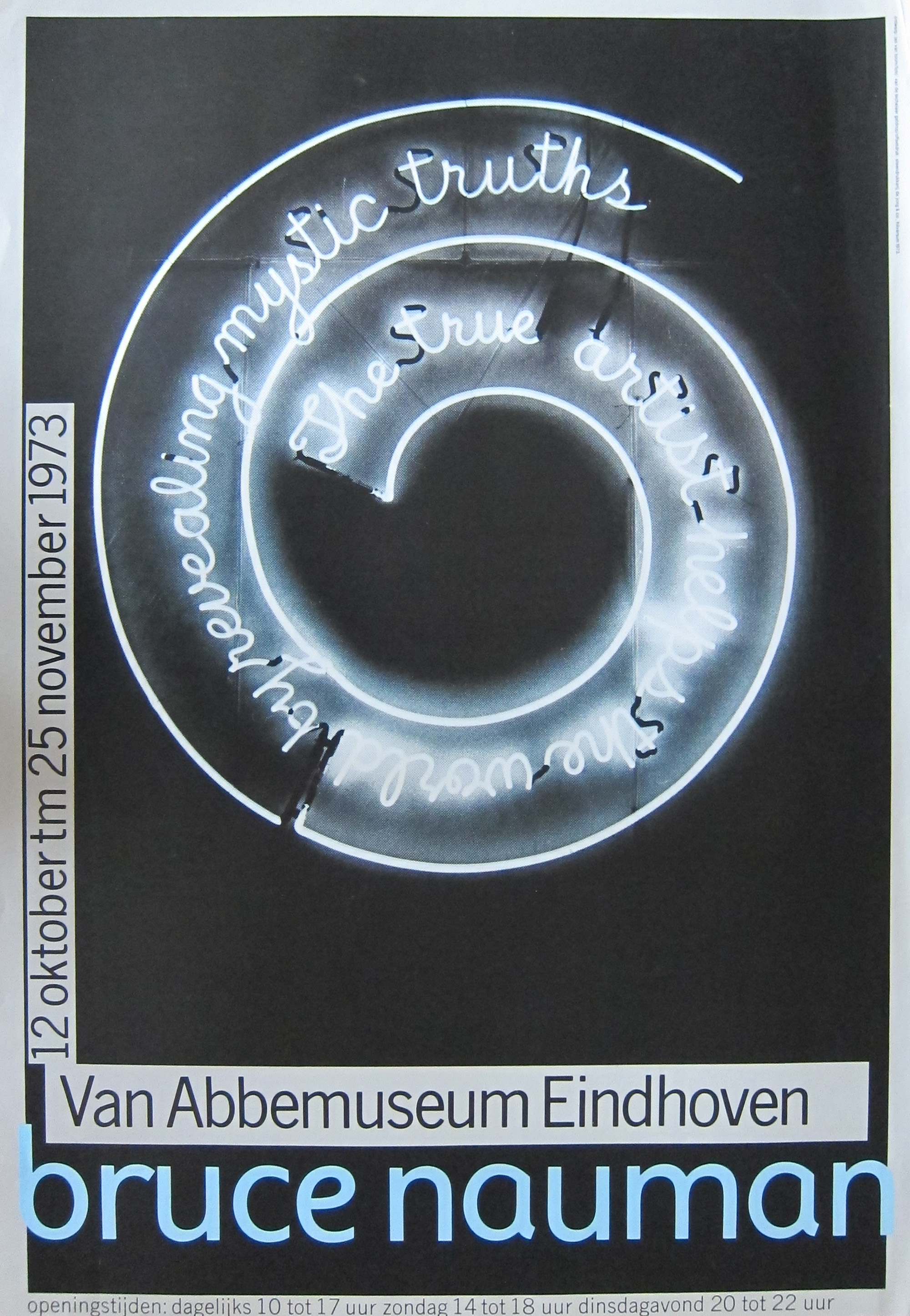
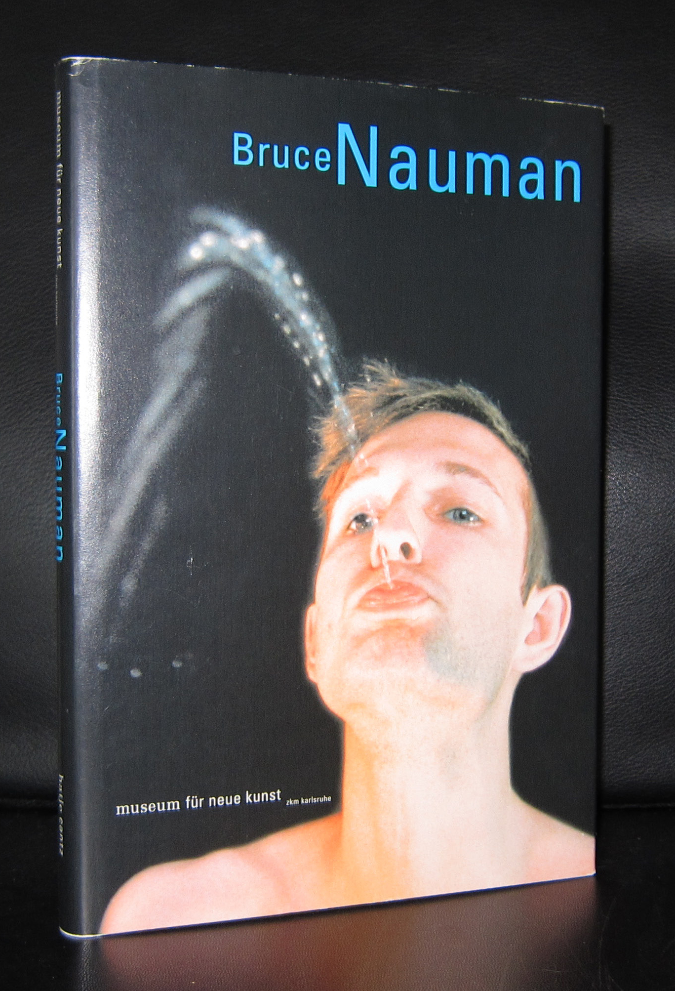
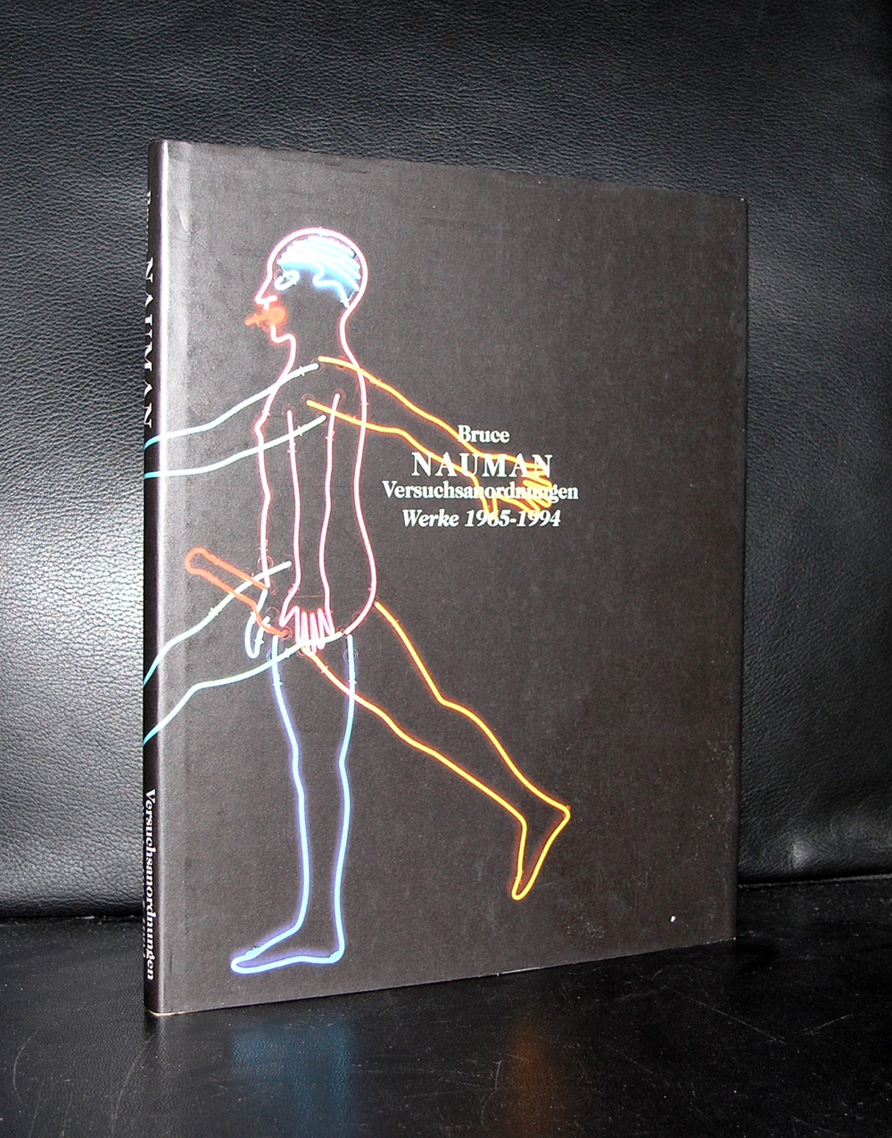
Why a blog on Bruce Nauman? simple, because i think he is one of the truly great artist from the 20th century. Never have met him, but i was one of the first to see his spectacular carousel with dead animals of which several versions are known. The one in the collection of the Gemeentemuseum was bought by Rudi Fuchs for the collection of the Gemeentemuseum for a modest amount of only 300k guilders, but at that time it was a huge amount for the museum. I am glad that it was bought because together with the Donald Judd in the garden and the large Sol LeWitt, these works are the highlights in the acquisitions of the dutch museums in the eighties. Most of them collected dutch art and did not focus on the international art scene. For this different point of view on collecting the Gemeentemuseum is now rewarded with some excellent, international important, works of art , which are great additions to their collections…..but back to Nauman. Nauman way of interpreting socially relevant subjects and translating them into works of art using language and neon made him a first.

Nauman began in the 1960s with exhibitions at Nick Wilder’s gallery in Los Angeles and in New York at Leo Castelli in 1968 along with early solo shows at the Los Angeles County Museum of Art and the Whitney Museum in 1972. Nauman’s use of neon as a medium was very recurrent in his works.  Neon also connotes the public atmosphere by the means of advertising, and in his later works he uses it ironically with private, erotic imagery as seen in his Hanged Man (1985).

Square depression.jpg

His Self Portrait as a Fountain (1966) shows the artist spouting a stream of water from his mouth. At the end of the 1960s, Nauman began constructing claustrophobic and enclosed corridors and rooms that could be entered by visitors and which evoked the experience of being locked in and of being abandoned. A series of works inspired by one of the artist’s dreams was brought together under the title of Dream Passage and created in 1983, 1984, and 1988.[ In his installation Changing Light Corridor with Rooms (1971), a long corridor is shrouded in darkness, whilst two rooms on either side are illuminated by bulbs that are timed to flash at different rates.

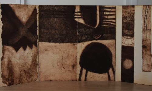
Since the mid-1980s, primarily working with sculpture and video, Nauman developed disturbing psychological and physical themes incorporating images of animal and human body parts, depicting sadistic allusions to games and torture together with themes of surveillance. In 1988, after a hiatus of nearly two decades focused on time-based media, he resumed his work with cast objects. And at this time he made several versions of the “CAROUSEL”.

the Gemeentemuseum “Carousel” from 1988

Schermafbeelding 2017-07-18 om 14.10.28

The stainless steel version in action

Books available at www.ftn-books.com

Posted on Leave a comment

George Hendrik Breitner (1857-1923)

Schermafbeelding 2017-07-18 om 13.41.55

What makes this painter so special for me?… Possibly because he made one of the paintings i truly admired when i was young.

One of the first times i visited the Rijskmuseum and the Stedelijk Museum i encountered this beautiful woman, lying on a couch, wearing nothing but a red japanese kimono. Everything is the paintings was new to me. Dutch impressionism, the loose touch with the brush, the high details and the sensuality in the painting made it beautiful to me. What i did not know at that time, is that Breitner was one of the first to use photography as a start for his paintings and this girl in a red kimono ( name was Geesje Kwak , a famous model at that time) would be painted in many versions and depicted on many paintings. There are “Red Kimono” paintings in the collections of the Rijksmuseum, Stedelijk Museum, Museum Twenthe, Teylers Museum. A few years ago there was this exhibition in the Rijksmuseum on all these versions of the girl in the red kimono. Unfortunately i did not visit it , but i still have some excellent catalogues on Breitner available at www. ftn-books.com and study this wonderful painting.


https://youtu.be/rWwWtKRnFMs

These and other titles on Breitner are available at www. ftn-books.com


Posted on 16 Comments

Guido Lippens (1939).. ever changing style

Schermafbeelding 2017-07-18 om 13.30.12

Guido Lippens has made paintings and drawings in so many styles. Sometimes with a free hand like the drawings by Jan Schoonhoven and other times painted, like a super realistic painting,…. with grids and patterns. Paintings for the art of painting, but without any depth or feeling. Lippens , born in Zeeland is not very known outside this province, but has had his moments and exhibitions during the last 5 decades. He even had one time an exhibition in the Stedelijk Museum Amsterdam, but his most famous one was the one in the Noordbarabants Museum, which catalogue is available at www.ftn-books.com

OLYMPUS DIGITAL CAMERA

Posted on 54 Comments

Eva Besnyö (1910-2003)

Schermafbeelding 2017-07-18 om 12.19.02

Born in Hungary, educated by Pecsi and advized to continue her education in Berlin she met John Fernhout, the son of Charley Toorop and married him and became a dutch citizen. She worked and lived practically her entire life in the Netherlands and because of the contacts she made through her husband she became one of the most important artist photographers of her time. She contributed to many publications with her excellent photographs and for the DOLLE MINA movement ( Womens Liberation movement) she was the house photographer. Personally i find her 50’s and early sixties photographs the most intriguing . They stand out from the rest. I was surprised to find so many books with her photographs in my inventory but one has to be mentioned separately. Eva Besnyö in Bergen is special.

For more Eva Besnyö search at www.ftn-books.com on Besnyo and find more

Posted on Leave a comment

Japanese posters ( 1977 )…catalogue by Wim Crouwel

The Stedelijk Museum Amsterdam has a history with posters and specially the posters from Japan were presented on multiple occasions within exhibitions on the subject. In 1977 , the “Japanse Poster” exhibition catalogue was designed by Wim Crouwel, who designed a very special catalogue for the exhibition . The catalogue is one of the best from the seventies and instead of the typical Crouwel typography

on the cover there are Japanese letters drawing your attention. Red lettering on a silver background let this one stand out from the rest.

Stedelijk Museum#JAPANSE AFFICHES# Crouwel, 1977, NM

This catalogue was published with number 617 within the series of published Stedelijk Museum catalogues.